Don’t try to solve problems. Just answer, why ?


The world is full of startup mentors, that try to guide founders, on creating applications that solve people’s problems. Companies like 37signals suggest that you should “scratch your own itch”, and create software that solves your problems and then it will probably solve somebody else’s as well. While it is indeed a great way to start working on something, it is not the only way. Furthermore it doesn’t answer the question: “What if my problem is that I don’t have a problem ?”.

Smoking reggae guy

How can you not have a problem ?

There can be many reasons why you may not have a problem. First of all it’s quite possible that you already are, in a perfectly functioning ecosystem where there are no big problems left to solve. One such ecosystem is operating systems. Sure we all have our minor complaints about what we can do with our computers, but generally speaking, the operating systems of today are quite powerful and easy to use.

It is also a common case to see a problem lying right in front of you, and at the same time see a lot of people trying to solve it. This means that people are in the process of trying out things on the commonly perceived problem and a great solution will come out sooner or later. One such case is JavaScript development in web applications. Today’s applications need so much to be interactive and responsive, that developers have to write huge amounts of JavaScript to make it happen. The huge volume of JavaScript code required creates a chaos, and obviously developers need tools to bring order in their code.

At the same time a large numbers of open source projects are trying to do just that. A few that I’m aware of are backbone.js, ember.js, AngularJS, Tower.js and node.js. The real problem right now is choosing the best way to solve that problem. It will take some time for the dust to sit down, and we see one of these projects emerge from the pack as the dominant solution. Either way it is obvious that there is no problem for you to solve, since a lot of others are already solving it.

There’s more than repairing

So if there are no problems for you to solve, what is the alternative ? Let’s get back to the start and remember that the end goal of a company is to provide value. And while it is true that when your TV is broken, a repairman will be of some value to you, it is not always the case. Some people choose to repair TVs, some others try to create new ones and some others just try to sell them to you. Not only nobody considers the repairman the most important part on the TV chain, but most people will agree that he’s often the less important.

Why ? Why ? Why ?

Why was Instagram a success ? We already had the option of sharing photos on twitter and facebook with a few taps, and we also had some filters in software like Photoshop and iPhoto. Instagram just made it easier. So if you were asked by someone, “Why should I use Instagram ?”, the answer would be: “Because it allows you to easily share manipulated photos”. It didn’t solve any problems, it didn’t do anything not possible before. But it created a new pleasurable way of hiding that you are just an amateur photographer using a phone’s camera with a crappy lens.

Everyone I know has at least some free time, one way or another. And this free time has to be filled somehow. Some people watch TV, some play video games and some just go for a walk. And while it works, and we manage to fill our free time everyday, we all know, that honestly everything gets quite boring after a while. Even the most conservative people I know, are willing to try something new if the risk is low and they have a reason to do it. And since by definition, software is mostly a low risk product we should all focus on giving people reasons to use our products.

Why should I use Flipboard ? Because it’s like a magazine on the iPad.
Why should I use Path ? Because it’s like Facebook, but without the annoying people.
Why should I use X ? Because of Y.

Your startup is an X trying to create a Y and therefore complete the sentence and justify it’s existence. And while I believe that solving someone’s problem creates enormous value, just answering the why, is often a great shortcut when you got no problems to solve.

Why you need boring conventions


In the last few years, I have visited London and Frankfurt. Both are Huge urban zones, with London being the largest urban zone in Europe. In both cities I had to use the metro (or subway, or whatever you want to call it) to get from the airport to the city center and vice versa.

When I first sat foot in Frankfurt, I saw a railway map similar to the one below:

Frankfurt railway system

Ouch! What a fucking mess! I said to myself. What do all those icons mean ? And why are some places written sideways ? How am I supposed to turn my head when I’m looking for something ? And how do I get back to the airport once I get to the city center ?

I asked some people in the airport and finally found my way around. But once I got in the city center, I had trouble getting back resulting in one hour lost. Of course it was not a pleasant experience and this coupled with the ultra-dirty trains, have placed Frankfurt quite low in my list of future destinations.

A couple of years later I visited London which is at least two times larger than Frankfurt. I was expecting, given the size of the city, that I would have an even hardest time moving around. To my surprise, when I landed in Heathrow I saw this, outside the train station:

London subway railway tube map

What an improvement! Everything written horizontally, all lines clearly visible and an amazing index in the bottom left with anything I needed to know. They even have small red airplanes next to all stations that can take you back to the airport. How cool!

Needless to say, I had no problem whatsoever finding my way around London, wasting zero time, and without having to ask around.

Now back to the real world…

Earlier today I had to ask one of my team members to rename some database tables according to our boring convention of plugin_table_name. So since the arrangement_types table is obvious that contains arrangement types, it had to be renamed to arrangement_arrangement_types.

Duh! What meaningless convention you may think. Rest assured it is not. When you want to export all database tables belonging to a certain plugin, or when you want to make a list of each plugin’s tables, to create an upgrade procedure it pays off.

Remember that one hour I lost in Frankfurt ? Every time you break a convention, you lose one hour some time in the future and you destroy your coding experience. Maybe even more if you consider that it’s a journey that you will repeat many more times.

Retina MacBook Pro, what does it mean for web design


With the new MacBook Pro, for the first time, a high resolution retina display is used on a computer. A large number of questions are raised about what software and web developers must do, to ensure their software products conform with what seems to be, a new generation of computers. First of all…


retina macbook pro 2012


Does the retina MacBook Pro signal a new generation of computers ?

Yes it does. As the smartphone market already proved, Apple never had any interest in turning the river back. The retina display is a huge advantage for Apple and it is certain, that in two years the most, the entire Apple line-up will feature the retina display. With other computer manufacturers (most notably Sony) already using high definition 1920×1080 monitors in a wide range of products, it will not be a surprise if we see the entire PC market going down the high resolution road pretty soon.

What exactly is the retina display ?

It is a display with double resolution than the classic displays, most of us use in our computers. For example the iPad 2 had a resolution of 1024×768, the iPad 3 which uses the retina display has a resolution of 2048×1536. Similarly the “simple” MacBook Pro has a resolution of 1440×900 while the new retina MacBook pro has a resolution of 2880×1800.

Does it mean that everything on the retina is smaller ?

No. Retina was created to increase the clarity and sharpness of displayed elements, not to fit more stuff onto the screen. Everything on the retina display takes up four times more pixels than a classic display since the retina display provides four times more pixels (two times more pixels times two dimensions = four times more pixels). However the end result to the user is that everything looks like still having the same size, but rendered using four times more pixels, therefore looking much better.

For example, a 960 pixel web layout will still occupy the same space on a retina display but will be rendered using four times more pixels. In other words the browser will automatically “convert” it to a 1920 pixel layout without any change required in the markup. Try to think the retina display as change in pixel density, not in pixel number.

OK, so what’s the catch ?

While text is rendered using the operating system’s fonts which are already designed to be rendered equally good at any size, the same is not true for images. When your computer renders a font, it just needs vector data from the font file and then the operating system takes care of the rest. However when you need to display an image in a space four times larger, you need to have the information about the pixels that will occupy the new space. It is like trying to display a 300×100 image in a 600×200 space using <img src=”something.jpg” width=”600″ height=”200″ />.

Showing an image in the retina is something similar . The browser will have to display an image in a space four times larger and inevitably will have to guess the new pixels in order to resize the image. Unfortunately it is impossible for any software to make a guess good enough to resemble what an image should really look like if it was four times larger.

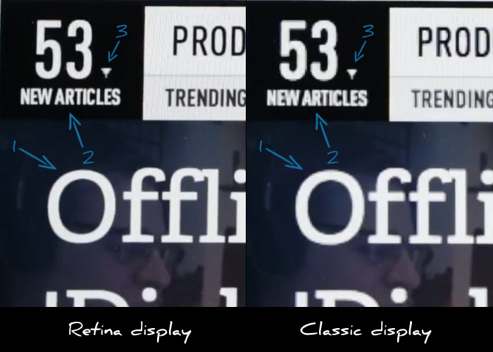
Let’s consider the above image which is a still from the Verge’s review on the retina MacBook pro.

I have highlighted the following three points of interest:

  1. MacBook pro on the left renders the letter O’s curves with much more detail making it much sharper.
  2. Small text looks much more readable on the retina display.
  3. The retina display fails to render the small triangle with more precision.

As you easily see, while text rendering is noticeably improved, images appear “pixelated” since they cannot provide any additional visual information. Websites that use images to display text elements with fancy fonts (for example in menus) will have their menus appear “pixelated” when compared to sites that use plain text. This means that this already bad practice is now even worse.

What about photos ?

As we’ve already discussed it’s up to the browser to resize the image. Does that make any actual difference to the user or do resized images look good enough ?

As it stands, browsers do a terrible job at resizing images. Resized images look blurry and pixelated. The best resizing software that I’m aware of  is Adobe Photoshop. So let’s assume that browsers will not be late to implement an equal quality filter when resizing images. How will that make photos look on retina displays ?

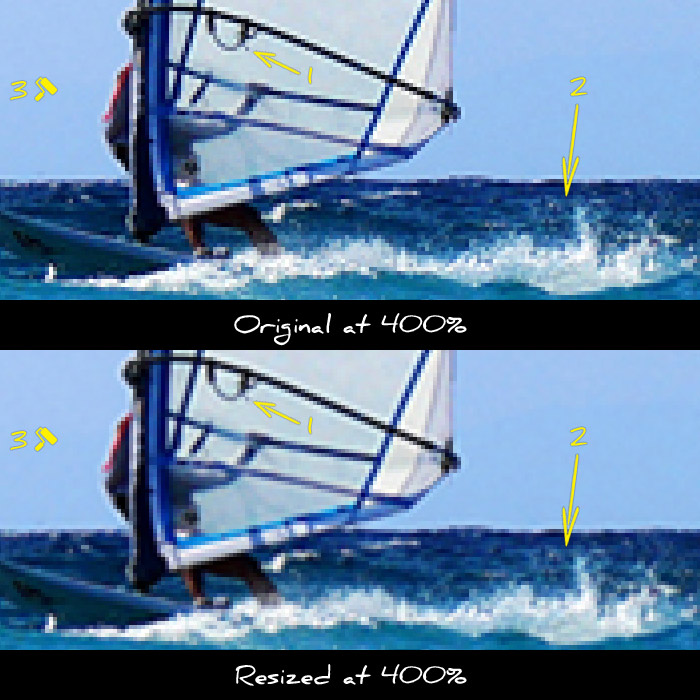
Let’s use this photo as an example. In the next two thumbs I cropped a small part of the image and zoomed in to 400%, so that all details are clearly visible. The first preview is a piece of the image with no resizing implemented. The second one is the same part, resized to twice it’s size and then downscaled back to the original size so we can compare the two.

original vs resized image for retina MacBook Pro

Notice the following differences:

  1. The sail has lost some of it’s detail
  2. The waves look blurry and far less detailed
  3. The blue in the sky looks washed out

As you can see the reduction in image quality is quite noticeable. As a result there will be a noticeable advantage to websites that take care to provide higher resolution images.

How can I provide images for retina displays ?

The best way to avoid resizing is to provide images with double resolution even if you want to display them in in half their size. This is done by specifying a smaller size in the width and height attributes in the image tag.

For example let’s assume that you want to display a photo in a 300×300 pixel box. You should upload and use a 600×600 version of the photo and use the following markup: <img src=”example.jpg” width=”300″ height=”300″ />. This way your image will be shown in a 300×300 pixel box, but the browser will have enough visual information to show it correctly in higher resolution displays since you provided an image of double resolution.

Note that this technique requires that you do actually have higher resolution images. If you try to use this technique using low resolution images resized in software like Photoshop, you will only move the resizing procedure from the browser to your photo editor. This way you will still provide low quality images while wasting your time resizing and greatly increasing the image size. Which brings us to our next question…

What is the bandwidth cost ?

While providing higher resolution images is a great practice and greatly improves the user experience, one shall not forget the increased bandwidth required for downloading these images. Of course there is no general rule as to how much the size increase is, but depending on the image the increase in file size can be up to 4x.

Such a file size is forbidding for mobile users. Developers should resort to server side browser detection techniques to serve lower size images to mobile users. Even if you use responsive design techniques for your layout, you won’t be able to avoid the server side for the images part.

Conclusion

Higher resolution displays are here to stay. We should all make haste to implement new ways of providing high detail images to our web sites and applications. However one should carefully study all available options before choosing which way to go. Expect more on this as I will have my hands on a retina MacBook Pro in a couple of weeks.

Using WordPress P2 as a development log


What is WordPress P2 ?

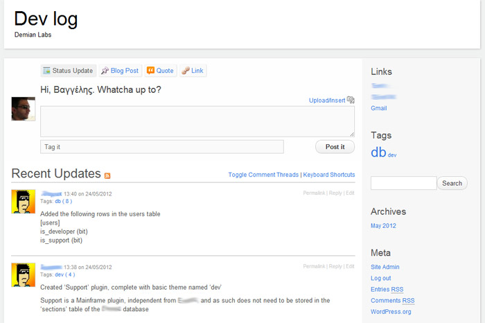
P2 is a theme for WordPress which eliminates the need for using the WordPress administration interface. You can post right from your blog’s home page and see your changes right away. P2 transforms WordPress to a social-media-like platform since anyone can easily post updates which are immediately available to everyone.

With the use of a couple of plug ins we transformed a WordPress installation to a private log for all developers of the team. Every time a developer makes a “radical” change to the database or code base that the rest of the team should know about, he can post it on P2 and therefore inform everyone instantly. We no longer have to use boring files to store a list of changes, or email people when we need to update them on the latest stuff going on in the project.

How to use P2 as a development log/blog

  1. Download and install WordPress to a sub domain of your main site (for example devlog.company.com)
  2. Download and install the P2 theme
  3. Activate the new theme through Appearance > Themes, in WordPress administration
  4. Download and install Private WordPress plugin to make sure that only logged users can view your log
  5. Download and install Global Hide/Remove Admin Bar plugin to get rid of the annoying black WordPress bar
  6. Create user accounts through Users > Add new, in WordPress administration
  7. Log in and start posting


Hey! The internet sucks. Let’s make it better!


The internet was one of the most important revolutions in the history of mankind. There is no doubt that no other technology has made the information age a reality like the internet has. However in the wrong hands, it can be made a tool to discriminate, annoy and treat people with disrespect.

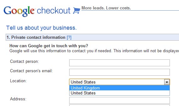
The images bellow are real screenshots from web pages that I’ve encountered in my daily browsing. Some companies think that there are some priviledged countries, and the rest of the world. And those companies obviously think that those two categories should not be treated equally.

We live in a planet where everyone is connected with the rest of the world through the net. Twitter spreads the news faster than TV or newspappers. We are constantly moving towards a more connected future. It is innevitable that all these practices of discrimination will fail sooner or later. It is common sense that some people just don’t get the medium.

We deserve a better web and we have the tools to develop a better web. We also have the responsibility to create a better internet. So if you are a web developer or designer, or work in a startup, you should know that there is always room for improvement. You don’t need a million dolar idea to make a difference. Take a sad web app and make it better.