The “home tablet” use case scenario


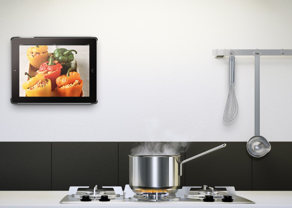
As people buy more and more tablets, the time has come to see old tablets permanently docked around the house. The living room hi-fi player tablet, the kitchen tiny tv tablet. While this gives the impression that people will still use a tablet, in reality this is an entirely new use case.

RingO Multi Pack for iPad

So far we used to design our apps based on two dominating use case scenarios.

a) People are sitting in front of a computer at work, or at their personal laptop at home or while traveling. In this case it was safe to assume that the device was to be used for a long time span, and that the user had logged in the device and had a personalized selection of software and settings. Simply put, the user was using a customized environment, and had ample time to spend.

b) People are using their smartphone, much likely outside their house, but even inside the house as a secondary activity. This is not as clear as the computer use case, but still we got some constants. The user has his personal choice of software available, and may or may not have lots of time to spend. Still he’s using a personal device.

I highly recommend reading Luke Wroblewski‘s articles on the topic, such as this one.

In the new “home tablet” use case, we don’t have the “personalized device” concept any more. Consider the case where we got an old iPad 2 in the kitchen so we can quickly find recipes and watch youtube videos while having a snack. What other software fits in this device ? First of all let’s check at more parameters to get a better understanding of what people expect in this case.

  • It is possible that you don’t have your favorite apps pre-installed.
  • You have not logged in, in any app or website in this device.
  • You don’t have much time to spend in the device. If you got 5 minutes to spend in the kitchen altogether, the time you can spend in the device drops to half a minute or less.
  • Because of the above,  the attention span for any website can be 5 seconds or less. Comparing that to the 12 seconds we consider the norm in the computer world, it’s a huge change.

So in order for any software, to even have a shot at being used, at these new “home tablet” conditions it has to:

  • Have very clean and simple design. Menus with few items, clear separation of content and navigation and labels that describe exactly what functionality they perform. 
  • Display only the most important information. Most email tablet apps would fail this. Even the relatively simple Gmail iPad app is too bloated for a “home tablet”.
  • The application should be used without an account. We can’t expect people to lose 20 of their 30 seconds trying to type an email/password combination.
  • Even if the app must absolutely log in the user, this must be done in the simplest way possible. The preferred way would be to just log in by just tapping a button and using a third party provider like facebook or google to log-in. Even if that’s not possible, at least the app must remember the last used username, and ask the user only for a password.
  • A very powerful search engine. This should allow people to quickly perform searches to find “that brown sofa I was looking this morning at work”.
  • An easy way to find information stored from other devices, and an easy way to send information to other devices. We can expect that people will want to continue where they left off in another device.

The good news is that most well designed apps which take UX into account should already satisfy these criteria. These are qualities that were already important, but now will become absolutely necessary. As people divide their time into more and more devices, specialized power-user features will become less important. Less features IS the feature in such use cases.

The web is the platform that can better serve these needs. Not only because nobody will have time for app-stores, but because native apps serve the concept of a walled data space. On the other hand, the web has always had openness in mind, with linking being it’s primary concept. A web app can link to a specific point to another web app, where a native app can only serve it’s private space and has no visibility to the rest of the device.


Why you need boring conventions


In the last few years, I have visited London and Frankfurt. Both are Huge urban zones, with London being the largest urban zone in Europe. In both cities I had to use the metro (or subway, or whatever you want to call it) to get from the airport to the city center and vice versa.

When I first sat foot in Frankfurt, I saw a railway map similar to the one below:

Frankfurt railway system

Ouch! What a fucking mess! I said to myself. What do all those icons mean ? And why are some places written sideways ? How am I supposed to turn my head when I’m looking for something ? And how do I get back to the airport once I get to the city center ?

I asked some people in the airport and finally found my way around. But once I got in the city center, I had trouble getting back resulting in one hour lost. Of course it was not a pleasant experience and this coupled with the ultra-dirty trains, have placed Frankfurt quite low in my list of future destinations.

A couple of years later I visited London which is at least two times larger than Frankfurt. I was expecting, given the size of the city, that I would have an even hardest time moving around. To my surprise, when I landed in Heathrow I saw this, outside the train station:

London subway railway tube map

What an improvement! Everything written horizontally, all lines clearly visible and an amazing index in the bottom left with anything I needed to know. They even have small red airplanes next to all stations that can take you back to the airport. How cool!

Needless to say, I had no problem whatsoever finding my way around London, wasting zero time, and without having to ask around.

Now back to the real world…

Earlier today I had to ask one of my team members to rename some database tables according to our boring convention of plugin_table_name. So since the arrangement_types table is obvious that contains arrangement types, it had to be renamed to arrangement_arrangement_types.

Duh! What meaningless convention you may think. Rest assured it is not. When you want to export all database tables belonging to a certain plugin, or when you want to make a list of each plugin’s tables, to create an upgrade procedure it pays off.

Remember that one hour I lost in Frankfurt ? Every time you break a convention, you lose one hour some time in the future and you destroy your coding experience. Maybe even more if you consider that it’s a journey that you will repeat many more times.

Retina MacBook Pro, what does it mean for web design


With the new MacBook Pro, for the first time, a high resolution retina display is used on a computer. A large number of questions are raised about what software and web developers must do, to ensure their software products conform with what seems to be, a new generation of computers. First of all…


retina macbook pro 2012


Does the retina MacBook Pro signal a new generation of computers ?

Yes it does. As the smartphone market already proved, Apple never had any interest in turning the river back. The retina display is a huge advantage for Apple and it is certain, that in two years the most, the entire Apple line-up will feature the retina display. With other computer manufacturers (most notably Sony) already using high definition 1920×1080 monitors in a wide range of products, it will not be a surprise if we see the entire PC market going down the high resolution road pretty soon.

What exactly is the retina display ?

It is a display with double resolution than the classic displays, most of us use in our computers. For example the iPad 2 had a resolution of 1024×768, the iPad 3 which uses the retina display has a resolution of 2048×1536. Similarly the “simple” MacBook Pro has a resolution of 1440×900 while the new retina MacBook pro has a resolution of 2880×1800.

Does it mean that everything on the retina is smaller ?

No. Retina was created to increase the clarity and sharpness of displayed elements, not to fit more stuff onto the screen. Everything on the retina display takes up four times more pixels than a classic display since the retina display provides four times more pixels (two times more pixels times two dimensions = four times more pixels). However the end result to the user is that everything looks like still having the same size, but rendered using four times more pixels, therefore looking much better.

For example, a 960 pixel web layout will still occupy the same space on a retina display but will be rendered using four times more pixels. In other words the browser will automatically “convert” it to a 1920 pixel layout without any change required in the markup. Try to think the retina display as change in pixel density, not in pixel number.

OK, so what’s the catch ?

While text is rendered using the operating system’s fonts which are already designed to be rendered equally good at any size, the same is not true for images. When your computer renders a font, it just needs vector data from the font file and then the operating system takes care of the rest. However when you need to display an image in a space four times larger, you need to have the information about the pixels that will occupy the new space. It is like trying to display a 300×100 image in a 600×200 space using <img src=”something.jpg” width=”600″ height=”200″ />.

Showing an image in the retina is something similar . The browser will have to display an image in a space four times larger and inevitably will have to guess the new pixels in order to resize the image. Unfortunately it is impossible for any software to make a guess good enough to resemble what an image should really look like if it was four times larger.

Let’s consider the above image which is a still from the Verge’s review on the retina MacBook pro.

I have highlighted the following three points of interest:

  1. MacBook pro on the left renders the letter O’s curves with much more detail making it much sharper.
  2. Small text looks much more readable on the retina display.
  3. The retina display fails to render the small triangle with more precision.

As you easily see, while text rendering is noticeably improved, images appear “pixelated” since they cannot provide any additional visual information. Websites that use images to display text elements with fancy fonts (for example in menus) will have their menus appear “pixelated” when compared to sites that use plain text. This means that this already bad practice is now even worse.

What about photos ?

As we’ve already discussed it’s up to the browser to resize the image. Does that make any actual difference to the user or do resized images look good enough ?

As it stands, browsers do a terrible job at resizing images. Resized images look blurry and pixelated. The best resizing software that I’m aware of  is Adobe Photoshop. So let’s assume that browsers will not be late to implement an equal quality filter when resizing images. How will that make photos look on retina displays ?

Let’s use this photo as an example. In the next two thumbs I cropped a small part of the image and zoomed in to 400%, so that all details are clearly visible. The first preview is a piece of the image with no resizing implemented. The second one is the same part, resized to twice it’s size and then downscaled back to the original size so we can compare the two.

original vs resized image for retina MacBook Pro

Notice the following differences:

  1. The sail has lost some of it’s detail
  2. The waves look blurry and far less detailed
  3. The blue in the sky looks washed out

As you can see the reduction in image quality is quite noticeable. As a result there will be a noticeable advantage to websites that take care to provide higher resolution images.

How can I provide images for retina displays ?

The best way to avoid resizing is to provide images with double resolution even if you want to display them in in half their size. This is done by specifying a smaller size in the width and height attributes in the image tag.

For example let’s assume that you want to display a photo in a 300×300 pixel box. You should upload and use a 600×600 version of the photo and use the following markup: <img src=”example.jpg” width=”300″ height=”300″ />. This way your image will be shown in a 300×300 pixel box, but the browser will have enough visual information to show it correctly in higher resolution displays since you provided an image of double resolution.

Note that this technique requires that you do actually have higher resolution images. If you try to use this technique using low resolution images resized in software like Photoshop, you will only move the resizing procedure from the browser to your photo editor. This way you will still provide low quality images while wasting your time resizing and greatly increasing the image size. Which brings us to our next question…

What is the bandwidth cost ?

While providing higher resolution images is a great practice and greatly improves the user experience, one shall not forget the increased bandwidth required for downloading these images. Of course there is no general rule as to how much the size increase is, but depending on the image the increase in file size can be up to 4x.

Such a file size is forbidding for mobile users. Developers should resort to server side browser detection techniques to serve lower size images to mobile users. Even if you use responsive design techniques for your layout, you won’t be able to avoid the server side for the images part.

Conclusion

Higher resolution displays are here to stay. We should all make haste to implement new ways of providing high detail images to our web sites and applications. However one should carefully study all available options before choosing which way to go. Expect more on this as I will have my hands on a retina MacBook Pro in a couple of weeks.

Using WordPress P2 as a development log


What is WordPress P2 ?

P2 is a theme for WordPress which eliminates the need for using the WordPress administration interface. You can post right from your blog’s home page and see your changes right away. P2 transforms WordPress to a social-media-like platform since anyone can easily post updates which are immediately available to everyone.

With the use of a couple of plug ins we transformed a WordPress installation to a private log for all developers of the team. Every time a developer makes a “radical” change to the database or code base that the rest of the team should know about, he can post it on P2 and therefore inform everyone instantly. We no longer have to use boring files to store a list of changes, or email people when we need to update them on the latest stuff going on in the project.

How to use P2 as a development log/blog

  1. Download and install WordPress to a sub domain of your main site (for example devlog.company.com)
  2. Download and install the P2 theme
  3. Activate the new theme through Appearance > Themes, in WordPress administration
  4. Download and install Private WordPress plugin to make sure that only logged users can view your log
  5. Download and install Global Hide/Remove Admin Bar plugin to get rid of the annoying black WordPress bar
  6. Create user accounts through Users > Add new, in WordPress administration
  7. Log in and start posting


Does the plus one button improve search engine ranking ?


We all know about Google’s plus one button. What most of us don’t know is whether it is something more than a way for people to like our website our product. Since it’s made by Google, a lot of SEO specialists have suspected that Google may improve the search engine rankings of websites using the button, with the obvious end goal of making the button popular.

As with all things SEO, there’s no scientifically proven answer to this question. Even if Google does modify it’s search engine rankings in order to promote it’s own product (button) it will never admit it in public. All we can do is observe and assume.

random text generator

A couple of years ago I built a small util that generates random text. It helps designers by providing random text that looks real in their demos. You may have guessed by now that it’s called random text generator. It’s just a language selector and a form essentially so I’ve had just a couple of ads on top and on the side of the form just for the sake of it. The ads are bringing some change every month but nothing serious. The traffic is a few thousand page views a month.

When the plus one button came out, I though I’d give it a try on this tool and see how it goes. About four months ago I removed the top advertising banner and installed the button next to the logo as you can see in the image above. To my surprise the advertising revenue did not change at all, despite the fact that I’ve removed half the advertising space. I guess this is yet another reminder that advertising, when done on a small scale and without serious targeting is practically worthless.

However traffic from Google started rising almost immediately on a rate of 10% to 15% per month. The cumulative traffic growth over the last four months is around 50%. The best part is that in contrast to retweets and facebook likes the google plus button clicks stay. Any people with google+ friends who clicked the button will see it as a recommendation in their search results now and in the future. Of course facebook and twitter buttons have other uses and benefits and I’m not suggesting not to use them.

However the moral of the story here is that the Google plus one button seems to work very well and is definitely worth a top spot in any webmaster’s toolkit. Also since I’m promoting other products of mine on this website from time to time, it is a nice outcome to increase traffic and reduce advertising space. Of course none of the above is official and it’s just my personal observations, but I hope you get the point!

Update:
It seems others have also noticed SEO benefits from the +1 button.
The latest that caught my eye is a post from INC magazine.