How to test your mobile web site or app across multiple devices
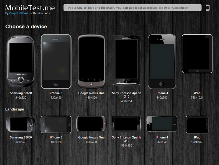
MobileTest.me is a tool that allows you to see how your web site or app looks across different mobile devices and resolutions. You select a device, type the URL you want to test and it will show you the selected device displaying your website in the device’s original resolution. As you can see in the picture below all types of devices are covered, from the relatively small Samsung S3650 to the iPad.
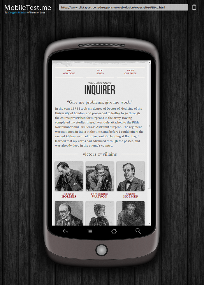
Everytime you test a different website, the URL changes dynamicaly. This allows you to send the exact same test to someone just by sharing the URL. For example this link is a classic responsive design example by a list apart as seen on the Google Nexus one in landscape mode. Real life scenarios include showing completed work to clients or pointing out bugs and errors to collueagues.
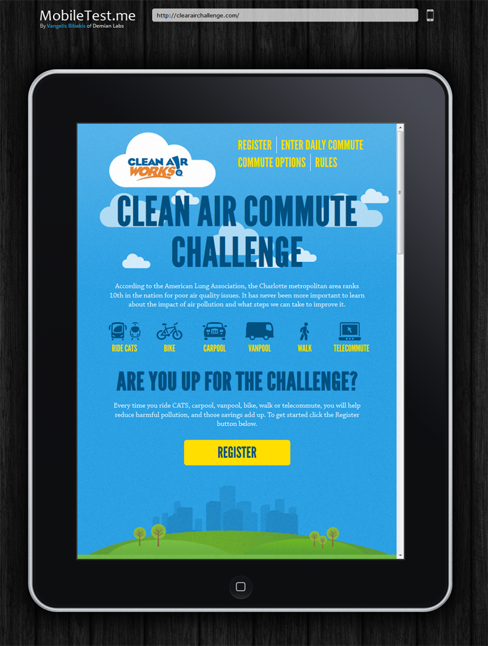
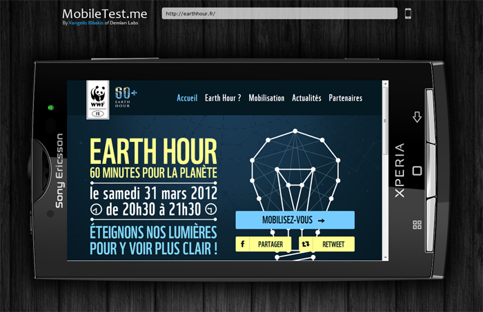
Click on any of the images bellow to see the corresponding test.


