topic: Demian Labs | Saturday, December 8, 2012
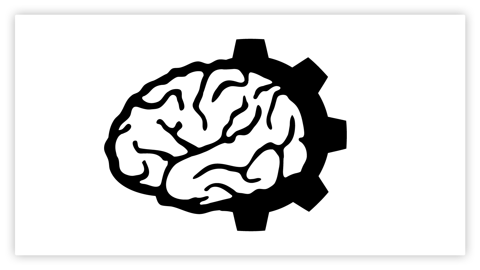
After some long brainstorming sessions, me and Jason came up with the concept of our new logo. It should be a clear iconic sign that makes immediately clear that we are a think tank and at the same time we got the horsepower to materialize our ideas. The new logo does just that and on top of it, matches our philosophy that technology and machinery are a interdependent part of human nature since the times of Hephaestus.
This is a great example of how to evolve ideas by simplifying each part to the point where it becomes an iconic pointer to a particular concept. The steps below illustrate the though process we did to get to the final result.


topic: Demian Labs | Saturday, October 29, 2011
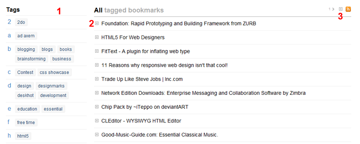
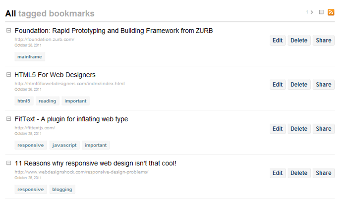
I’ve uploaded a few changes in Deskhot which make the interface simpler and easier to use. Now your bookmarks in Deskhot look like the picture below:

The new interface
1) The new tags index now groups tags by letter and shows group letter in the left side. This allows you to scan the index very fast when looking for a particular tag.
2) All extra options of a bookmark (edit/delete/share) and extra information like tags and date, are now hidden and you can show them by clicking the small expand button next to a bookmark. This way you can now focus on your bookmarks and find very easy the one you are looking for instead of being distracted by the many buttons of the previous interface.
3) Just in case you prefer the old way of having tags and buttons shown for all bookmarks, you can click the expand all button. Deskhot will remember your preference and keep it that way if you want all your bookmarks expanded.
3b) You may noticed a number with a small arrow next to it. This is the next page button. So now you don’t have to go to the bottom of the page to find the next page link. This is very useful when you remember that a bookmark is on page 3 for example. You can find it with just two clicks.

Expanded bookmarks
The new changes make Deskhot an even better tool for your bookmarking/archiving/organizing needs. I believe now it’s one step closer to the original vision of a central place to store all your information. The new notes feature which I’m already preparing will bring it even closer to that goal.
topic: Demian Labs | Wednesday, October 5, 2011
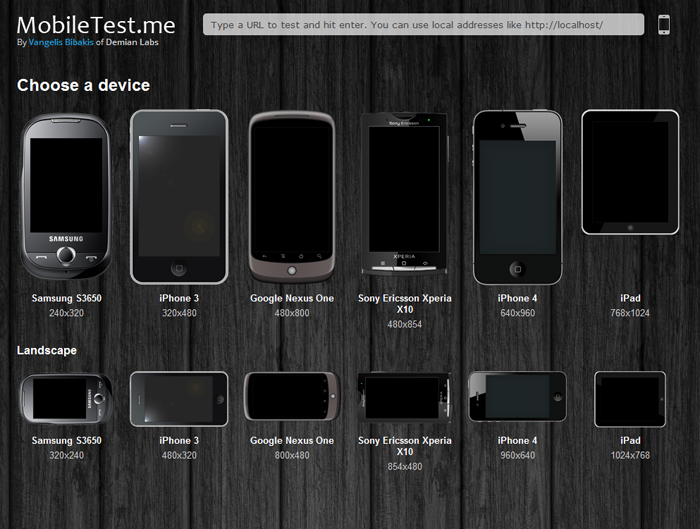
MobileTest.me is a tool that allows you to see how your web site or app looks across different mobile devices and resolutions. You select a device, type the URL you want to test and it will show you the selected device displaying your website in the device’s original resolution. As you can see in the picture below all types of devices are covered, from the relatively small Samsung S3650 to the iPad.

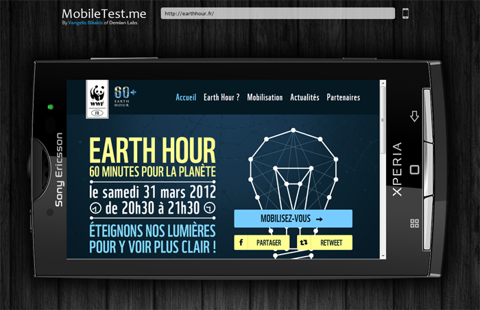
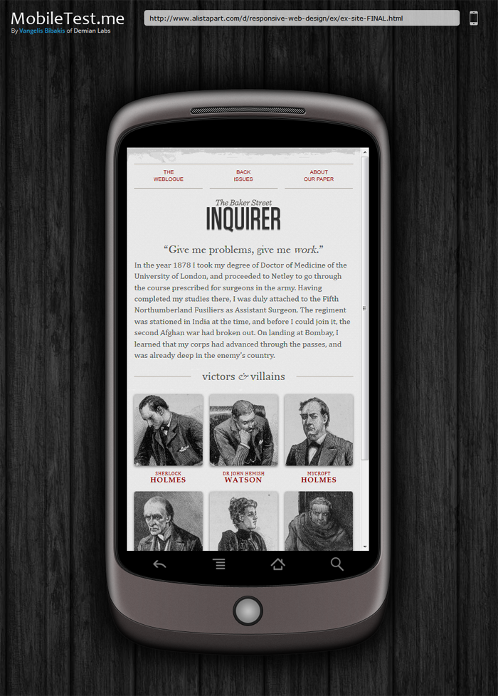
Everytime you test a different website, the URL changes dynamicaly. This allows you to send the exact same test to someone just by sharing the URL. For example this link is a classic responsive design example by a list apart as seen on the Google Nexus one in landscape mode. Real life scenarios include showing completed work to clients or pointing out bugs and errors to collueagues.
Click on any of the images bellow to see the corresponding test.


topic: Demian Labs | Tuesday, June 28, 2011
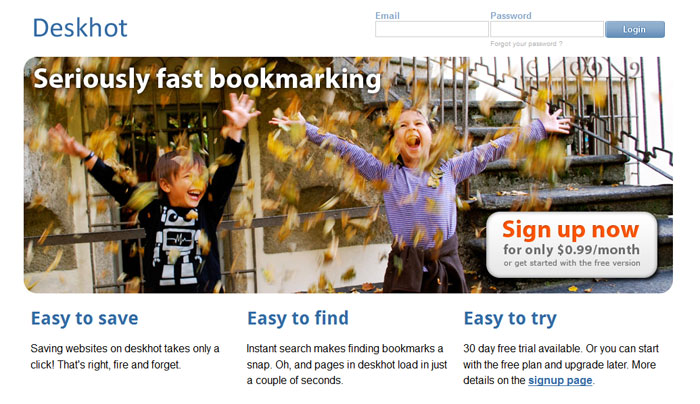
A new, simpler, cleaner homepage is about to go online for deskhot. This is how it looks.

The aim of the new design is to give out “the message” quicker. Taking out the gradients allows the eye to focus more on the text. On top of that the picture with the kids is great. It gives a warm welcome to new visitors.
topic: Demian Labs | Sunday, May 1, 2011
April has been a great month with new stuff and improvements for the existing ones. More new people started using Deskhot and the number of stored bookmarks is about to hit the first milestone. I have installed analytics on Deskhot in an effort to get more information on the way people use it and make future improvements based on real-world usage. Besides these and lots of bug fixes for Deskhot here’s what new came out of the lab over the last month.
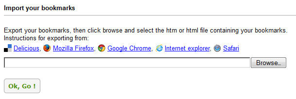
Import bookmarks on Deskhot
Deskhot can now import your bookmarks from your browser or delicious. This was one of the features planned for later but certain events made this top priority. An extensive post will go online in a few days with more details on this.

New favicon for Deskhot
When you have 10 or more tabs open and you need to get to your bookmarks right away, till now you had to scan the tab bar titles for deskhot. This was taking some time and was a bit annoying. I created a new favicon in plain blue and white. The new favicon is far simpler and now Deskhot is easy to spot among the other tabs.

New design for the lab
A new theme for the lab gave more focus on content and separated navigation completely. Now text is a bit bigger and the centered headlines make spotting the beginning of each article much easier. The text in the sidebar was rewritten and anything non-trivial was moved in the bottom of the page.

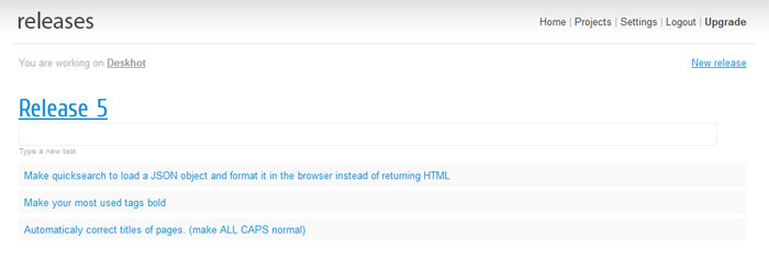
Releases: task management for people who create products
The problem with project management tools today is that they attempt to organize everything, making it easier for supervisors to have a global view of a production process. Releases puts the people who actually create a product in the center of attention. The single most important thing in producing any product is not work-hours or work units or anything else. It is the way the product is gonna be when it’s finally released.
By focusing on product releases you eliminate a lot of the “project management noise”. Sure, things like work-hours are nice to know but they remove your focus from what really matters. Releases purposely removes all that information so people who make the actual work can focus on what is top priority. It is currently in the early stages of development. Expect a private beta in a couple of months.

New posts
How Google wasted time and resources trying to copy Facebook and why you shouldn’t do it on
Forget the competition. Just use your products
How to create an invisible login form that you don’t have to look for on
The little details of the web
Why you shouldn’t waste your time on the iOS vs Android debate on
Native mobile applications VS the web
topic: Demian Labs | Monday, April 4, 2011
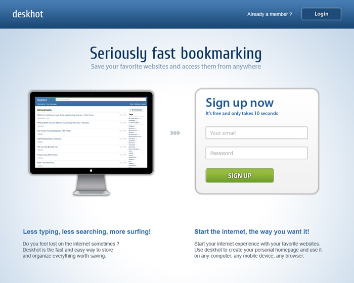
With it’s first public release scheduled for April 11 it’s time to show you what’s coming. Since Deskhot is the no-nonsense approach to web bookmarking, it’s introduction screen follows the same principle. And since we’ve taken anything unnecessary out of the equation it’s “Seriously fast”!

topic: Demian Labs | Tuesday, March 29, 2011
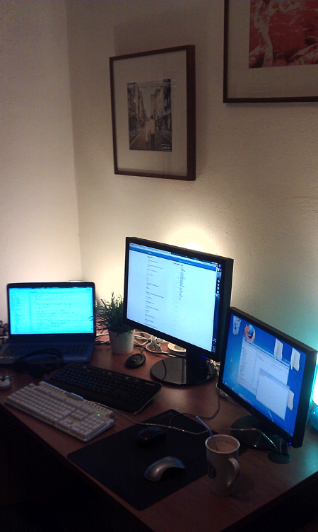
This is what our lab looks like. At any given time the window shades are down to ensure a night like experience (a basic element of quality code). The laptop on the left is connected to the monitor in the middle. A filling 24″ giving something more than a full HD resolution. The computer on the right serves as an emergency backup workstation and a hide-box for distractions like twitter.
Behind each monitor there is a lamp providing ambient light to prevent eye fatigue. The (plastic) plant and the vinyl covers on the wall add bits of home warmth to an otherwise quite cold environment.
