The human layer


Like thousands of other self-respecting professionals you may have been trying very hard to stay competitive by focusing on the little details. Details that others are missing. I’m sure you’ve read hundreds of blog posts on how you should tune notifications so they are less intrusive, or how you should design forms and dialogues in software to be more intuitive. You may even have gone so far as to attend UX conferences and passionately brought up related topics in many meetings in your company.

human layer

Huge demand, little improvements

I’m sure that in your mind, you have a belief that you are trying hard to understand your customer’s needs and create great products. You know what ? You are trying hard! And I’m extremely happy that there are many people like you, trying to make great digital products.

But maybe, you, just like me, always had the feeling that you are still missing something. That despite all the hard work you do, there’s always a vague void. A feeling that despite all the stats, numbers and knowledge, there is still a missing link between you and your customers. It’s not an irrational fear. It’s true. There is a missing link between you and your customers. And the worse part, is that this gap is huge.

You have absolutely no idea what your customers want. Even more you got no idea what your customers need. You can study about UX, marketing and product design all you want. You will slightly improve some metrics, you may even be so lucky as to build a successful business (which is a huge feat by the way), but you won’t make huge leaps. You will sense that there is huge demand for approachable, sexy, interesting, easy to use digital products. Yet you’ll be unable to capitalise on that demand, and deliver the maximum.

How real people think

Let us leave these questions here, and let me tell you a few stories. I was recently on a trip to my home island. Meeting family and friends, getting away from work for a bit, trying to have a good time. I had a few, let’s say shocking experiences while seeing how ordinary people interact with products (digital or not).

human layer

First, there was Katerina. She is one of the classmates that I still keep an eye on. Because you know, there is this thing called facebook that lets us monitor the life of someone who shared the same classroom with us twenty years ago. Katerina shared a video on facebook about a movie that was supposedly secret. And according to her comment, we should all rush and see that movie, because it’s so amazing, and also “they’ll take it down any moment now”.

This movie was a documentary about people who study the paranormal and all that crap. The funny part is that, there was a guy in that video, who claimed that he was able to get a parking spot every time, just because he thought about his desire to park his car. Funny considering that I have the same fantasy for years and still I have to wait for hours before I park my car.

I can understand this guys motive to claim extraterrestrial mind powers. Everybody wants to be famous, right? But why does this blog have 70,000 followers on facebook, and why is it considered be in risk of being taken down. As if it’s a very valuable secret that “they” are trying to hide. I honestly have no idea, and I absolutely cannot understand those people.

Then there is this pal of mine. He’s called Nick and he’s got some free time in his hands right now. He makes musical instruments from wood and metal. Specifically, he makes his own custom variations of Brazilian and African instruments. He showed them to me, and even did a small demonstration. It’s incredibly interesting! Using stuff most of us would throw in the trash, he makes stuff that sound absolutely amazing. Although I admire his dedication and his passion about it, I honestly cannot understand it. I don’t know what motivates a person to spend hours of research, hours of hard work, to create something that has value mostly only for him.

And the last story is about my sister. I recently bought a new laptop, and gave her my old macbook air as a gift. Having been part of endless debates on OSX vs Windows, I was very curious as what her reaction would be, interacting with a mac for the first time, after years of using windows computers. So after I let her use the macbook for about one day, I asked her what did she think about the new laptop.

Her: It’s great. I can now make up without going to the bathroom!
Me: Great. Wait, WHAT ? !
Her: See ? Here, it has a mirror.

It turns out the “mirror” was a conferencing app, which comes with every mac. This app’s icon is on the default icons on the OSX dock. She probably randomly clicked the app icon, saw her face on the screen, and thought: “hey, why go all the way to the bathroom”. Now to get you into context, she is a doctor. She’s got more than 10 years of education and quite high income. This means that she’s got the customer profile that we would expect to appreciate a well designed computer.

On the contrary she didn’t give a single fuck about the skeuomorphism vs flat design debate. She didn’t even care that her new operate system was built on the “industrial strength of UNIX”. Let alone the intuitive dialogues and the lack of viruses. Who gives a fuck about all that “chinese”, when you can make up in your computer. I honestly believe that even Jakob Nielsen would be unable to understand this customer segment.

Time for answers

human layer

Do you get it now ? People are absolutely irrational. Not in the sense that they like “sexy” designed icons instead of three more features. They simply do not give a fuck about all the things, that we think that they are so extremely important. And since I don’t want to go to sleep tonight, worrying, that I didn’t put enough emphasis on something so extremely important: THEY DON’T CARE. They don’t give a dime, period.

They don’t care if your icons are copied from another app. They don’t care if you are using bootstrap because you’re too lazy to write your own css. They don’t care if you can get to a screen in two steps instead of four. They don’t care if your backend is in PHP or rails. And they certainly don’t care if Samsung copies Apple or if it’s the other way around.

On the contrary, most people who make digital products, spend the majority of their time on exactly those things that no “real person” cares about. We spend hours debating and discussing about the little details in our products. It seems that we forgot the single most important topic. Who cares ?

So how can we put all the irrelevant questions aside, and focus on what’s important? It’s simple. We have to become irrational ourselves. And to do that we must not analyse our own products. Instead we must analyse the products we buy, but we don’t care about. Gladly we all have products that we don’t care about yet we still buy. Why did I buy tobacco X instead of Y ? Was it the packaging ? Was it the flavour ? Was I influenced by my friends’ opinion ?

The “human layer”

The analysis, and execution of products, based on basic human emotions is what I call the “human layer”. I’ve seen many companies adding a bullet to a powerpoint on their product being “user friendly”. I’m sure in their heads they must think that they try to understand users. I really wish it was that easy.

The human layer is everything. It’s the top (if not the only) reason, people make decisions. Why they buy products. Why they buy something instead of something else that has similar traits or features.

Forget about features, forget about metrics, forget about trying to understand others using the metrics that are important to you. Your customers are, not designers or engineers. They are simple humans. And the missing link between you and them, is the human layer.

Why web designers should kill the hover right now and how to replace it


Note: This is a post written on August 29, 2010 in my personal website, Bibakis.com.
It has moved here, mostly for archival.

The hover effect or “mouse over” back in the early days is quite common in websites these days. Unfortunately it’s one of those bad habits that harm the user experience. I guess in a few years we’ll be laughing at hovers, like we now laugh at frames and tables.

iceberg-effect

Touch is here to stay
As we speak about 200,000 touch screen devices are purchased in the US alone every day. This includes Android smartphones, iPhone and the iPad. You can easily imagine that in a couple of years touch screens will be the norm and mouse based interfaces will be considered “business tools”. Instead of creating multiple versions of your web application why not consider getting rid of mouse-only features ?

Even if people continue to use computers at the same rate as they do today in the future, and even if you don’t plan to deploy your application on mobile devices you still need to forget about the hover. The average user will soon forget that you can expect something to come out if you place your cursor in a link. The reason is that users won’t be running into hovers on the majority of devices (and the most part of their browsing time).

Drop down menus
This is one of the major annoyances in the web for quite some years now. When evolutions in CSS popularized the use of drop down menus, a lot of designers tried to imitate the behavior of desktop applications. Unfortunately they forgot a very important aspect of desktop-like menus. Once you click, they stick! The sudden disappearance of sub-menus made surfing an adventure since users were expected to hunt menus around the page. Have a look at this great study on the topic: Users Decide First; Move Second

If it’s not visible it doesn’t exist
From time to time I’ve happen to surf Facebook with a friend or two. The majority of people I know are not aware of the additional options when hovering over some areas of the page. This is not a surprise as hover destroys the principle of what you see is what you get.

Can you imagine a car or a cd-player with hidden options ? I guess not. Then why should we design web interfaces that way ? Can we realistically expect people to scan the whole screen with the mouse, just in case the designer had the idea to hide some elements ? Most people have a quick look at the page and if something doesn’t appear there they just assume it doesn’t exist. Of course they are right to think so. Nothing else requires you to imagine where parts of it’s functionality are hidden but the web of today.


How can you replace mouse over


Organize information the smart way

The best way to de-clutter an interface and therefore avoid the need for hiding things, is to organize information in a human friendly manner. If you build your information structure in a simple and efficient way, everything can be “hidden” in the next page. The best example I can think off is the apple homepage.

Apple is a multinational company selling a huge variety of products and services, from smartphones and mp3 players to business server operating systems. Yet, in the main menu of apple.com website there are only seven options plus the link to the home page. Let’s take the “Mac” section for example. Instead of having a drop down menu with sub-options like MacBook, MacBook Air, iMac and so on, you are given these options only once you are taken to the “Mac” section. Each page has as few options as possible, yet you never feel that something is missing.

hover_apple
Apple.com’s main menu: Only seven options in a website with a vast amount of information


Use “click and drop” (pop-over)
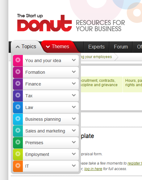
This is a relatively new technique to the web. When you click on a button, you are presented with some options regarding your further actions. This is a great way to hide things like advanced search options. In the picture on the right you see an implementation in the main menu of startupdonut.co.uk.

In this case, a user with a touch screen device can navigate as good as the mouse users and all the extra options are well hidden until you click topics button. An excellent use of the “click and drop” technique is anywhere you need filtering. For example, search results, viewing a list of products or like in our example, viewing blog posts tags.

hover_donut
Clicking “topics” on the main menu of startupdonut.co.uk opens up the list of tags


Don’t forget lightbox
Lightbox is a nice solution when you want to give some information to the user quickly without sending him to another page. By clicking on a button you display a box on top of the page which can be an image, some HTML, or an iframe. You can use lightboxes for things like displaying notifications, showing the terms of use in a registration page, giving the user a quick preview of a shopping cart or for zooming images in a gallery. In the example on the right you can see the way facebook implemented it for sending a quick message.

hover_facebook
The most common implementation of lightbox: Sending a message on facebook

Taking care of the www issue in CodeIgniter


Note: This is a post written on July 24, 2009 in my personal website, Bibakis.com.
It has moved here, mostly for archival.

One of the problems that came up with the rising dependency on Google and SEO in general is the use of www. On the one hand there is no reason to use www anymore. 100% of modern browsers use the HTTP protocol by default so you don’t need to specify that you need to access the web part of a domain. It makes your site’s address larger and harder to remember, more ugly, less likely to fit alongside a logo. Also many suspect that it has an effect on your keyword density, therefore harming your search engine rank just a little bit.

On the other hand most of the users still keep the old habit of typing www.site.com in the address bar. I try to redirect to the “clean” version of the domain on all my sites. Even if the user uses the www he’s not harmed at all.

In fact most of the times nobody even notices. One way or another there is a solution to this. Whether you want to get rid of that 90s annoyance or you want to keep your domain a classic www there is an easy way to do this in codeigniter.

First create a hook in /application/config/hooks.php

$hook['post_controller_constructor'][] = array(
 'class'    => 'Utils_hook',
 'function' => 'redirect_to_base',
 'filename' => 'utils_hook.php',
 'filepath' => 'hooks'
);

This tells CodeIgniter to execute the “redirect_to_base” method before the controller starts executing it’s own methods. Then you need to create the file /application/hooks/utils_hook.php and place the following code inside

Class Utils_hook {
 function redirect_to_base(){
  $ci = & get_instance();
  $uri = $ci->uri->uri_string();
  // recreates the URL
  $location = substr(base_url(),0,strlen(base_url())-1).$uri;

  $active_base_url = 'http://'.$_SERVER['SERVER_NAME'].'/';

  if (($active_base_url != base_url()) && ($_SERVER['SERVER_ADDR'] != '127.0.0.1')){
   Header( "HTTP/1.1 301 Moved Permanently" );
   Header( "Location: $location" );
  }
 }
}

This way the visitor is always redirected to the URL version you want even if he entered through an old bookmark such as http://www.sitename.com/action/example/

Top or bottom of the page ? Where should you load your JavaScript ?


The JavaScript placement debate

A few years ago, Yahoo released a free benchmarking tool for web pages. Aka Yslow. This tool is measuring what and when loads, during a pageview. It then gives a report about what is slowing down your page and then makes some recommendations on how you can improve the performance of your site.


snail

One of these recommendations is that you should load your JavaScript in the bottom of the page, right before the closing </body> tag. The Yahoo people even went so far as to call this a “best practice”. Ever since, there is an ongoing debate among developers about the right place to load JavaScript files. Most people are indeed consider placing JavaScript in the bottom of the page a best practice. Is it so ?

When you put your JavaScript at the top of the page, the browser will start loading your JS files before the markup, images and text. And since browsers load JavaScript synchronously, nothing else will load while the JavaScript is loading. So there will be a timeframe of a few seconds where the user will see a blank page, while the JavaScript is loading.

On the other hand, if you place your JavaScript at the bottom of the page, the user will see the page loading first, and after that the JavaScript will load in the background. So if for example your CSS & HTML takes 5 seconds to load, and your JavaScript takes another 5 seconds, putting our JavaScript on the top of the page will give the user a “perceived” loading time of 10 seconds, and putting it on the bottom will give a “perceived” loading time of 5 seconds.

I’m using the word perceived, because in both cases the page will be completely loaded in the same amount of time. In whatever order you place your assets, they still take the same time to load. All we can achieve by placing JavaScript at the bottom is how fast the user thinks the page has loaded. But still it sounds amazing, right ? By putting JavaScript at the bottom of the page, our pages will appear to be loading twice as fast.

The perception of “the web”

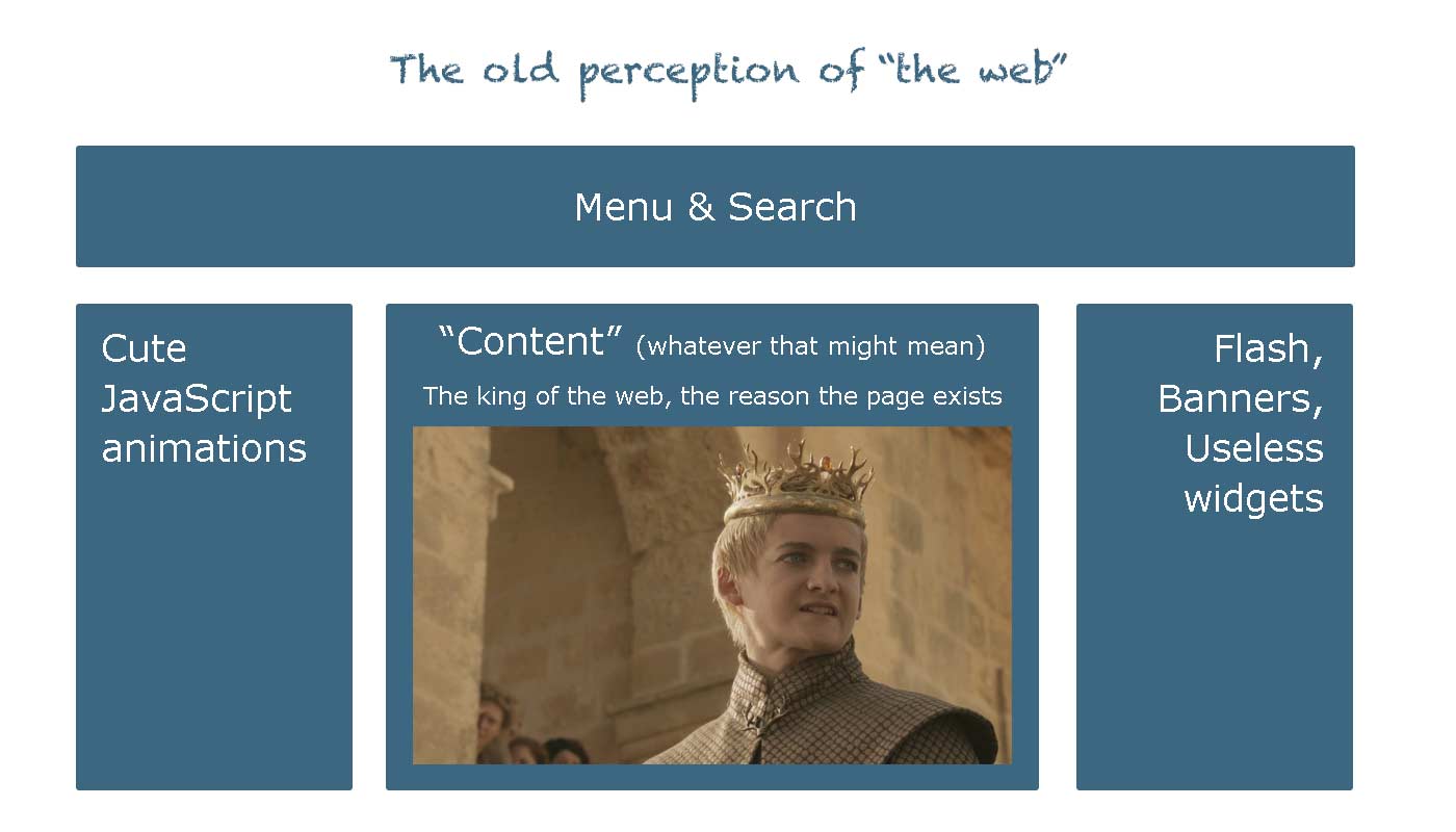
Well this used to be the big picture in the past. Back then, when the web was something very different from what it is today. Overgeneralizing, for the sake of simplicity, this is how the web was perceived by almost everyone (including web professionals) until recently.

the old perception

Since then much have changed. First and most important, we don’t talk about “web pages” these days. We now talk about “web apps”, “software in the cloud” and “software as a service”. The web used to be more like digital paper. A way to let people know about your company, a platform for your blogging, at best a place to read your email remotely. But now in 2013 the web is quickly replacing the remnants of desktop software and is battling toe to toe with Java and Objective-C, for domination on mobile devices.

All these concepts were a utopia, no more than five years ago. But today the content is no longer the king. The web is now a democracy. People don’t come to us for content anymore, they create it themselves. Our role as web developers is to empower them, by giving them the tools and functionality to create and interact with their content.

Forget about supporting IE6 and browsers without JavaScript. This is just a 5% of people who fear change, like some people never bothered to buy a computer at all. In a world where we are competing with native mobile developers over performance and features, we can’t afford to think of the web as anything other than pure software. In a way, functionality is the new content and JavaScript is the new king.

JavaScript placement in web applications

Back to our topic. Let’s get back to our example, where we load our JavaScript at the bottom of the page. The user is left for a few seconds with a perfectly looking HTML template where nothing is functional. If the users tries to perform an action and finds out that it’s not working, he will perceive our application as “broken”. What’s even worse, is that we have no way of letting the user know when the app will be fully functional.

On the contrary if we place our JavaScript on top, the user will get a blank page for a few seconds, but once the markup is loaded, everything will be fully functional from the first second. Therefore by purposefully giving the user a blank page, we are giving him information that the app is still loading. The user knows that the app will be functional when he sees boxes and buttons.

The user may think that our app is slow, or that his connection is having hick-ups or even that his device is slow. Not only we don’t take the full blame for the slow loading of our app, but we eliminate the possibility of the user interacting with a broken version of our application.

A few seconds to load the app is one of the most common things in digital devices in general. People wait for computers to boot up, for youtube videos to load, for Microsoft Word to open, for almost everything. Nobody will go crazy for a couple more seconds of waiting. But there is nothing worse than a user tapping a button which does not work. This is a breach of trust from the user end. If the app didn’t function correctly now, will it lose my data tomorrow ? Should I pick another app instead ?

Even the slow loading experience can be eased, using a simple loader like Gmail did.

gmail loading

Summarising, it really depends on what you’re making. If you’re still stuck in the “content” world then it’s maybe best to place your JavaScript at the bottom of the page. But if you are making web software you’re much better, placing JavaScript at the top, because functionality is the new king.

Our presentations to Joomla Day Greece 2013


Vangelis Bibakis recently gave two presentations to Joomla Day Greece.

In the first presentation he talks about MainframePHP, the framework we use to create web applications. The first parts of the presentation are a basic introduction with case studies and performance data. He goes into detail on how Mainframe compares to external libraries which provide similar functionality. This is also a great intro to people who are getting started with Mainframe and want to see how it implements concepts like theming and modularity.

Mainframe, the fast PHP framework from bibakis

In the How to get the tech job of your dreams presentation he explains why you should not have a CV and how to write a great cover letter.

How to get the tech job of your dreams from bibakis

The “home tablet” use case scenario


As people buy more and more tablets, the time has come to see old tablets permanently docked around the house. The living room hi-fi player tablet, the kitchen tiny tv tablet. While this gives the impression that people will still use a tablet, in reality this is an entirely new use case.

RingO Multi Pack for iPad

So far we used to design our apps based on two dominating use case scenarios.

a) People are sitting in front of a computer at work, or at their personal laptop at home or while traveling. In this case it was safe to assume that the device was to be used for a long time span, and that the user had logged in the device and had a personalized selection of software and settings. Simply put, the user was using a customized environment, and had ample time to spend.

b) People are using their smartphone, much likely outside their house, but even inside the house as a secondary activity. This is not as clear as the computer use case, but still we got some constants. The user has his personal choice of software available, and may or may not have lots of time to spend. Still he’s using a personal device.

I highly recommend reading Luke Wroblewski‘s articles on the topic, such as this one.

In the new “home tablet” use case, we don’t have the “personalized device” concept any more. Consider the case where we got an old iPad 2 in the kitchen so we can quickly find recipes and watch youtube videos while having a snack. What other software fits in this device ? First of all let’s check at more parameters to get a better understanding of what people expect in this case.

  • It is possible that you don’t have your favorite apps pre-installed.
  • You have not logged in, in any app or website in this device.
  • You don’t have much time to spend in the device. If you got 5 minutes to spend in the kitchen altogether, the time you can spend in the device drops to half a minute or less.
  • Because of the above,  the attention span for any website can be 5 seconds or less. Comparing that to the 12 seconds we consider the norm in the computer world, it’s a huge change.

So in order for any software, to even have a shot at being used, at these new “home tablet” conditions it has to:

  • Have very clean and simple design. Menus with few items, clear separation of content and navigation and labels that describe exactly what functionality they perform. 
  • Display only the most important information. Most email tablet apps would fail this. Even the relatively simple Gmail iPad app is too bloated for a “home tablet”.
  • The application should be used without an account. We can’t expect people to lose 20 of their 30 seconds trying to type an email/password combination.
  • Even if the app must absolutely log in the user, this must be done in the simplest way possible. The preferred way would be to just log in by just tapping a button and using a third party provider like facebook or google to log-in. Even if that’s not possible, at least the app must remember the last used username, and ask the user only for a password.
  • A very powerful search engine. This should allow people to quickly perform searches to find “that brown sofa I was looking this morning at work”.
  • An easy way to find information stored from other devices, and an easy way to send information to other devices. We can expect that people will want to continue where they left off in another device.

The good news is that most well designed apps which take UX into account should already satisfy these criteria. These are qualities that were already important, but now will become absolutely necessary. As people divide their time into more and more devices, specialized power-user features will become less important. Less features IS the feature in such use cases.

The web is the platform that can better serve these needs. Not only because nobody will have time for app-stores, but because native apps serve the concept of a walled data space. On the other hand, the web has always had openness in mind, with linking being it’s primary concept. A web app can link to a specific point to another web app, where a native app can only serve it’s private space and has no visibility to the rest of the device.


Why you need boring conventions


In the last few years, I have visited London and Frankfurt. Both are Huge urban zones, with London being the largest urban zone in Europe. In both cities I had to use the metro (or subway, or whatever you want to call it) to get from the airport to the city center and vice versa.

When I first sat foot in Frankfurt, I saw a railway map similar to the one below:

Frankfurt railway system

Ouch! What a fucking mess! I said to myself. What do all those icons mean ? And why are some places written sideways ? How am I supposed to turn my head when I’m looking for something ? And how do I get back to the airport once I get to the city center ?

I asked some people in the airport and finally found my way around. But once I got in the city center, I had trouble getting back resulting in one hour lost. Of course it was not a pleasant experience and this coupled with the ultra-dirty trains, have placed Frankfurt quite low in my list of future destinations.

A couple of years later I visited London which is at least two times larger than Frankfurt. I was expecting, given the size of the city, that I would have an even hardest time moving around. To my surprise, when I landed in Heathrow I saw this, outside the train station:

London subway railway tube map

What an improvement! Everything written horizontally, all lines clearly visible and an amazing index in the bottom left with anything I needed to know. They even have small red airplanes next to all stations that can take you back to the airport. How cool!

Needless to say, I had no problem whatsoever finding my way around London, wasting zero time, and without having to ask around.

Now back to the real world…

Earlier today I had to ask one of my team members to rename some database tables according to our boring convention of plugin_table_name. So since the arrangement_types table is obvious that contains arrangement types, it had to be renamed to arrangement_arrangement_types.

Duh! What meaningless convention you may think. Rest assured it is not. When you want to export all database tables belonging to a certain plugin, or when you want to make a list of each plugin’s tables, to create an upgrade procedure it pays off.

Remember that one hour I lost in Frankfurt ? Every time you break a convention, you lose one hour some time in the future and you destroy your coding experience. Maybe even more if you consider that it’s a journey that you will repeat many more times.

Retina MacBook Pro, what does it mean for web design


With the new MacBook Pro, for the first time, a high resolution retina display is used on a computer. A large number of questions are raised about what software and web developers must do, to ensure their software products conform with what seems to be, a new generation of computers. First of all…


retina macbook pro 2012


Does the retina MacBook Pro signal a new generation of computers ?

Yes it does. As the smartphone market already proved, Apple never had any interest in turning the river back. The retina display is a huge advantage for Apple and it is certain, that in two years the most, the entire Apple line-up will feature the retina display. With other computer manufacturers (most notably Sony) already using high definition 1920×1080 monitors in a wide range of products, it will not be a surprise if we see the entire PC market going down the high resolution road pretty soon.

What exactly is the retina display ?

It is a display with double resolution than the classic displays, most of us use in our computers. For example the iPad 2 had a resolution of 1024×768, the iPad 3 which uses the retina display has a resolution of 2048×1536. Similarly the “simple” MacBook Pro has a resolution of 1440×900 while the new retina MacBook pro has a resolution of 2880×1800.

Does it mean that everything on the retina is smaller ?

No. Retina was created to increase the clarity and sharpness of displayed elements, not to fit more stuff onto the screen. Everything on the retina display takes up four times more pixels than a classic display since the retina display provides four times more pixels (two times more pixels times two dimensions = four times more pixels). However the end result to the user is that everything looks like still having the same size, but rendered using four times more pixels, therefore looking much better.

For example, a 960 pixel web layout will still occupy the same space on a retina display but will be rendered using four times more pixels. In other words the browser will automatically “convert” it to a 1920 pixel layout without any change required in the markup. Try to think the retina display as change in pixel density, not in pixel number.

OK, so what’s the catch ?

While text is rendered using the operating system’s fonts which are already designed to be rendered equally good at any size, the same is not true for images. When your computer renders a font, it just needs vector data from the font file and then the operating system takes care of the rest. However when you need to display an image in a space four times larger, you need to have the information about the pixels that will occupy the new space. It is like trying to display a 300×100 image in a 600×200 space using <img src=”something.jpg” width=”600″ height=”200″ />.

Showing an image in the retina is something similar . The browser will have to display an image in a space four times larger and inevitably will have to guess the new pixels in order to resize the image. Unfortunately it is impossible for any software to make a guess good enough to resemble what an image should really look like if it was four times larger.

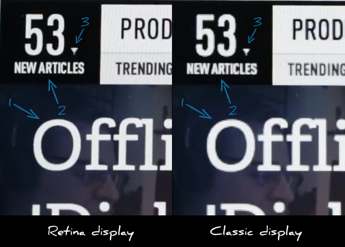
Let’s consider the above image which is a still from the Verge’s review on the retina MacBook pro.

I have highlighted the following three points of interest:

  1. MacBook pro on the left renders the letter O’s curves with much more detail making it much sharper.
  2. Small text looks much more readable on the retina display.
  3. The retina display fails to render the small triangle with more precision.

As you easily see, while text rendering is noticeably improved, images appear “pixelated” since they cannot provide any additional visual information. Websites that use images to display text elements with fancy fonts (for example in menus) will have their menus appear “pixelated” when compared to sites that use plain text. This means that this already bad practice is now even worse.

What about photos ?

As we’ve already discussed it’s up to the browser to resize the image. Does that make any actual difference to the user or do resized images look good enough ?

As it stands, browsers do a terrible job at resizing images. Resized images look blurry and pixelated. The best resizing software that I’m aware of  is Adobe Photoshop. So let’s assume that browsers will not be late to implement an equal quality filter when resizing images. How will that make photos look on retina displays ?

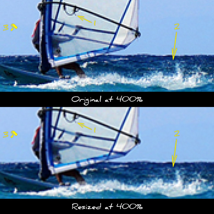
Let’s use this photo as an example. In the next two thumbs I cropped a small part of the image and zoomed in to 400%, so that all details are clearly visible. The first preview is a piece of the image with no resizing implemented. The second one is the same part, resized to twice it’s size and then downscaled back to the original size so we can compare the two.

original vs resized image for retina MacBook Pro

Notice the following differences:

  1. The sail has lost some of it’s detail
  2. The waves look blurry and far less detailed
  3. The blue in the sky looks washed out

As you can see the reduction in image quality is quite noticeable. As a result there will be a noticeable advantage to websites that take care to provide higher resolution images.

How can I provide images for retina displays ?

The best way to avoid resizing is to provide images with double resolution even if you want to display them in in half their size. This is done by specifying a smaller size in the width and height attributes in the image tag.

For example let’s assume that you want to display a photo in a 300×300 pixel box. You should upload and use a 600×600 version of the photo and use the following markup: <img src=”example.jpg” width=”300″ height=”300″ />. This way your image will be shown in a 300×300 pixel box, but the browser will have enough visual information to show it correctly in higher resolution displays since you provided an image of double resolution.

Note that this technique requires that you do actually have higher resolution images. If you try to use this technique using low resolution images resized in software like Photoshop, you will only move the resizing procedure from the browser to your photo editor. This way you will still provide low quality images while wasting your time resizing and greatly increasing the image size. Which brings us to our next question…

What is the bandwidth cost ?

While providing higher resolution images is a great practice and greatly improves the user experience, one shall not forget the increased bandwidth required for downloading these images. Of course there is no general rule as to how much the size increase is, but depending on the image the increase in file size can be up to 4x.

Such a file size is forbidding for mobile users. Developers should resort to server side browser detection techniques to serve lower size images to mobile users. Even if you use responsive design techniques for your layout, you won’t be able to avoid the server side for the images part.

Conclusion

Higher resolution displays are here to stay. We should all make haste to implement new ways of providing high detail images to our web sites and applications. However one should carefully study all available options before choosing which way to go. Expect more on this as I will have my hands on a retina MacBook Pro in a couple of weeks.

Using WordPress P2 as a development log


What is WordPress P2 ?

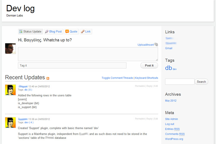
P2 is a theme for WordPress which eliminates the need for using the WordPress administration interface. You can post right from your blog’s home page and see your changes right away. P2 transforms WordPress to a social-media-like platform since anyone can easily post updates which are immediately available to everyone.

With the use of a couple of plug ins we transformed a WordPress installation to a private log for all developers of the team. Every time a developer makes a “radical” change to the database or code base that the rest of the team should know about, he can post it on P2 and therefore inform everyone instantly. We no longer have to use boring files to store a list of changes, or email people when we need to update them on the latest stuff going on in the project.

How to use P2 as a development log/blog

  1. Download and install WordPress to a sub domain of your main site (for example devlog.company.com)
  2. Download and install the P2 theme
  3. Activate the new theme through Appearance > Themes, in WordPress administration
  4. Download and install Private WordPress plugin to make sure that only logged users can view your log
  5. Download and install Global Hide/Remove Admin Bar plugin to get rid of the annoying black WordPress bar
  6. Create user accounts through Users > Add new, in WordPress administration
  7. Log in and start posting


Does the plus one button improve search engine ranking ?


We all know about Google’s plus one button. What most of us don’t know is whether it is something more than a way for people to like our website our product. Since it’s made by Google, a lot of SEO specialists have suspected that Google may improve the search engine rankings of websites using the button, with the obvious end goal of making the button popular.

As with all things SEO, there’s no scientifically proven answer to this question. Even if Google does modify it’s search engine rankings in order to promote it’s own product (button) it will never admit it in public. All we can do is observe and assume.

random text generator

A couple of years ago I built a small util that generates random text. It helps designers by providing random text that looks real in their demos. You may have guessed by now that it’s called random text generator. It’s just a language selector and a form essentially so I’ve had just a couple of ads on top and on the side of the form just for the sake of it. The ads are bringing some change every month but nothing serious. The traffic is a few thousand page views a month.

When the plus one button came out, I though I’d give it a try on this tool and see how it goes. About four months ago I removed the top advertising banner and installed the button next to the logo as you can see in the image above. To my surprise the advertising revenue did not change at all, despite the fact that I’ve removed half the advertising space. I guess this is yet another reminder that advertising, when done on a small scale and without serious targeting is practically worthless.

However traffic from Google started rising almost immediately on a rate of 10% to 15% per month. The cumulative traffic growth over the last four months is around 50%. The best part is that in contrast to retweets and facebook likes the google plus button clicks stay. Any people with google+ friends who clicked the button will see it as a recommendation in their search results now and in the future. Of course facebook and twitter buttons have other uses and benefits and I’m not suggesting not to use them.

However the moral of the story here is that the Google plus one button seems to work very well and is definitely worth a top spot in any webmaster’s toolkit. Also since I’m promoting other products of mine on this website from time to time, it is a nice outcome to increase traffic and reduce advertising space. Of course none of the above is official and it’s just my personal observations, but I hope you get the point!

Update:
It seems others have also noticed SEO benefits from the +1 button.
The latest that caught my eye is a post from INC magazine.

Why you should say no to responsive web design


Responsive web design is the latest buzzword in the web world. Everyone is making haste to learn about conditioning through media queries, flexible grids and so on and so on. However responsive design as it’s used at the moment is a negative trait and should be avoided at all costs. The reason is, that it’s a negative term by definition.

wrong size

You are confused a bit, right ? How can it be negative when you’ve seen all those great examples of websites that scale according to your device’s resolution. It seems to work in real life. Well I doubt that. And to throw our beloved responsive design showcases away, and get along with our post, just remember that all those great examples are simple content sites. And to make a long story short, simple content websites don’t justify the time needed to produce a great responsive design. Most of the times a wordpress with a mobile device detection plugin and a great mobile theme does the trick far easier.

For all other cases where you have a more complex website or a web application, where extra time and research is justified, responsive design still won’t do. And this because responsive design destroys the “device scemantics” (I just made up the term). This means that we use devices for a reason. Each device has a purpose and meaning, a reason why we bough it and why we use it.

For example, say I just landed from a plane and want to find quickly the phone number of Hotel X. I got my luggage in one hand, my coat on the other and can’t hold my phone near my face. If you show me a responsive design of the hotel’s website with lots of pictures and small text you’ve just made me angry. I already had trouble typing your website’s URL in the browser and just need a huge link labeled “Contact details” so I can call you and make sure my reservation is ok.

Of course the same is true not just for content but for apps as well. A form might be reasonably large when viewed from a desktop computer but way too big for a tablet or phone. I will want to store a PDF with an printable application form on my computer but will prefer the HTML version in my iPad.

Each device has it’s own natural time and space in our lives, we can’t just serve the same content and functionality everywhere just because we find it easier to have only one version of our website. Each device type has it’s own context and purpose and it’s our duty as web professionals to serve that purpose. Just because your layout doesn’t break on a smaller resolution, does not mean that you provided the functionality your visitor expected.

The way I see it, responsive design is an ugly workflow hack. And as such, it will not improve your long term strategy, whatever device type you consider your priority. Mobile web and tablets are way too important to be left in a hands of a few divs that collapse below each other when the resolution changes. Oh! and three wireframes simply will not do.

Responsive web design techniques should be used as an assistant to overcome different device specifications of the same type. Use these techniques to make sure that your website displays correct across all mobile phones but don’t take the same website to another type of device. If you plan to deploy on mobile and tablets, do yourself a favor and do it properly, with the right amount of planning and research.

Great user experience is in the details


Yesterday I was traveling from Athens back to my hometown. I woke up in the middle of the night cause of the endless snorring of one of the guys that shared the cabin with me. As I walked dizzy in the hallway trying to get a grip as to where I am, (and most of all, which floor) I reached the stairs and saw two large numbers right between the two floors. I immediately realized that I was in deck 8 and headed down to grab a coffee. It’s was really great to notice that instead of the millionth boring advertisement, someone thought that huge deck indicators were the way to go.

In the end of the day great user experience is quite simple. All it takes is walking in your user’s shoes. The rest comes quite naturally.

Templates & themes for CodeIgniter


One of the biggest drawbacks of a framework is the absence of built in theming functionality. CodeIgniter is no exception to that rule. Although there are quite a few libraries out there which aim to provide theming support, they don’t feel like being part of the framework. I was annoyed with having to use anything which looks like an ugly hack so I created a library which supports themes in CodeIgniter in a native style.

Templates for CodeIgniter

First of all let’s see how this baby works:

Using themes:

$this->load->theme('demo');
$this->load->view('home');

Loading CSS and Javascript files from within your views:

$this->load->css('/themes/demo/css/styles.css');
$this->load->js('/themes/demo/js/javascript.js');

Yes that was all. It is that simple.


Structure of your files

In the same path as your application folder create a theme folder and inside it a folder with the theme’s name. Also create a folder with the theme’s name inside views.

Inside the download you will see how the demo theme is structured.

/application/views/demo/...    (Your views go here)
/themes/demo/css/...           (CSS files)
/themes/demo/js/...            (Javascript files)
/themes/demo/theme.php         (The theme file itself)


Bonus: Caching control

Have you noticed that sometimes when you update your css or javascript files the changes don’t take effect until the browser empties it’s cache ? This library supports a suffix for all css and javascript files which allows you to control the caching of your files by the browser. Inside the config folder you will find a file mainframe.php. Make sure you autoload it and set a version for your files.

$config['cjsuf'] = '0.1';

When you change that version to say 0.2, browsers will be forced to reload them since they think it is a different file.


Inside the download there is a demo theme to get you started

Download it here


Multisite CodeIgniter with sessions preserved across subdomains using virtual hosts


As I’m creating the mobile version of deskhot as well as some new accompanying apps I came across the need to have a single multisite codeigniter base where I can do all the development instead of multiple installations.

What I needed and what this post covers:

  • Multiple web applications running from a single codeigniter instance.
  • Each application must have it’s own subdomain. For example deskhot.com, m.deskhot.com, pilot.deskhot.com and so on.
  • When a user logs in, in one application, he must be logged in, in all applications. So all applications must share the same session data.
  • Only one codeigniter system folder so upgrades can done once for all applications/subdomains.
    But also having the flexibility to have a certain application using an older system folder if I see fit in the future.

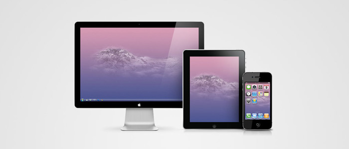
ipad iphone mac devices

So let’s get into action

1. Add the subdomains in your hosts file

All operating systems have a hosts file which helps map ip addresses to domains. Of course you should add all the subdomains in your hosts file. Here is the location of the hosts file for each operating system.

This is how my hosts file looks like

127.0.0.1        deskhot.d
127.0.0.1        m.deskhot.d
127.0.0.1        pilot.deskhot.d


2. Add a server alias in the apache config

The next step is configuring your virtual hosts so you can have apache know about your subdomains. In my system the vhosts file is located in /apache/conf/extra/httpd-vhosts.conf. This will be different in your system so just do a search and you’ll find it. There will be some default configuration for localhost already there.

Add the following in the end of the file:

<VirtualHost *:80>
    DocumentRoot "/path-to-your-document-root/your-domain.tld"
    ServerName domain.tld
    ServerAlias *.domain.tld
</VirtualHost>

For example my vhosts file looks like this (in a windows system)

<VirtualHost *:80>
    DocumentRoot "/Users/Username/www/DemianLabs/Deskhot.com"
    ServerName deskhot.d
    ServerAlias *.deskhot.d
</VirtualHost>

As you have guesses I access my development version through http://deskhot.d. You need to change the path and domain in the above lines to suit your own configuration.


3. Create your applications

Grab a fresh CodeIgniter and drop it in the folder where you would normaly do your single site development. Then make a copy of application folder for each of your subdomains. A tidy way to name all those application folders is to follow the patern application_subdomain. So for example my folders look like this:

/application                  // for the main site: deskhot.d
/application_m                // for m.deskhot.d
/application_pilot            // for pilot.deskhot.d
/system                       // the system folder
/user_guide                   // the user guide
/index.php
/license.txt

Once again change deskhot to your desired domain.

Next we need to tell CodeIgniter which application folder will be active depending on the url. To do that, open the index.php file and find the line containing $application_folder = ‘application’; and replace it with the following code:

switch ($_SERVER['HTTP_HOST']){
        case 'm.deskhot.d':
            $application_folder = 'application_m';
        break;

        case 'pilot.deskhot.d':
            $application_folder = 'application_pilot';
        break;

        default :
            $application_folder = 'application';
}

Once again change deskhot to your desired domain.


4. Configure all applications to share the same cookie domain

In each application folder find the file config/config.php and find the line $config[‘cookie_domain’]    = “”;. It’s around line 260.

Replace it with something like this depending on your domain:

$config['cookie_domain']    = ".deskhot.d";

Notice that this must be the same line in all config/config.php files in all application folders. This will ensure that all applications will read the same cookie and therefore use the same session data.


5. Specify a different system folder for each application (optional)

We can do the same trick we did in step 3 for the system folder as well. So for example we can have the following folders:

/system             // The latest CodeIgniter
/system_201         // Version 2.0.1
/system_202         // Version 2.0.2
.... and so on

To do that open index.php again and delete the line (around 65) $system_path = ‘system’;

Then change the code we used in step 3 to look like this:

switch ($_SERVER['HTTP_HOST']){
        case 'm.deskhot.d':
            $application_folder = 'application_m';
            $system_path = 'system';
        break;

        case 'pilot.deskhot.d':
            $application_folder = 'application_pilot';
            $system_path = 'system_201';
        break;

        default :
            $application_folder = 'application';
            $system_path = 'system';
 }

In this example all applications use the system folder except pilot, which is using system_201. This way you can upgrade CodeIgniter to a new version only for a specific application and leave the other ones using an older version. This can be handy when you want to do your post-upgrade testing in stages.


If you have any comments or questions I’d be glad to hear them on twitter or google+.
In a few days I’ll be writting a new post about how you can make all the applications share some common resources like helpers.

Why I’m not moving to Ruby on Rails (yet)


When you’re about to start a new project it’s the right time to move to something new. Sometimes it’s a new CSS or Javascript framework, sometimes it’s a new version control system, in my case it was moving from PHP/CodeIgniter to Ruby/Ruby on Rails.

CodeIgniter vs Ruby on Rails

I started out in my windows 7 laptop and came across a myriad of problems. The first time there was encoding problems. Google came to the rescue. Then I had to configure the system PATH variable a few times since there was no documentation to tell me what to configure. It worked out fine. After a lot of hours I reached the point where I have a working Rails 3 installation but no virtual hosts and of course no sub domains. Unfortunately Passenger doesn’t work on windows and it’s developers don’t plan a release anytime soon. So since I can’t find documentation on virtual hosts with ruby and I’m quite tired of googling I gave up on the idea.

Next stop was Ubuntu. The Rails version in the latest Ubuntu is still 2.x. There are no official repositories to give you a Rails 3 installation out of the box so the most reasonable option is RVM. To make a long story short, after a few hours of trying, it didn’t work. I’m quite well aware that other people have had more success than me but unfortunately for me things didn’t work out the way I wanted them to.

In PHP/apache world there are installers for windows that just work out of the box. In any Linux distribution things are even better. So since I don’t own a mac and I can’t spare any more time things are quite clear. The way I see it deployment for Rails is still lacking in options. Maybe Rails is a great way to build web applications and maybe it could save me time in the long run. But the way things are now, it just waists me time. So I’m sticking with CodeIgniter and I’ll revisit Rails next year when it will hopefully be more mature.

How to skyrocket MySQL performance the easy way


When you see your average page loading time going from 0.08 sec to 1.40 sec you know it’s time to do someting about it. I’ve run into this situation a few days ago and made some tweaks to my database. Now the average loading time is even lower at 0.05 sec. Here is how to do it.

MySQL logo

1. Create indexes

Indexes are a way for mySQL to scan through tables very fast. The greater the number of rows, the greater the speed improvement. The mySQL manual claims that in a table with 1000 rows, an index could speed up data retrieval by 100 times.

Let’s see how it works in action. Let’s assume for example that we have a simple application that stores all books in a public library. We will need a books table and an authors table to store our data. Since an author may have written many books, and some books can have multiple authors (like many tech books) this is a many to many relationship. So we also need a books_authors table for relating books to authors. So our tables will be:

1. books

CREATE TABLE books (
  ID INT,
  title VARCHAR(255),
  ISBN VARCHAR(255),
  date_published (date)
)

2. books_authors

CREATE TABLE books_authors (
  ID INT,
  book_id INT,
  author_id INT
)

3. authors

CREATE TABLE authors (
  ID INT,
  name VARCHAR(255),
)

Primary keys are automatically indexed by mySQL so we will turn our attention to the books_authors table. The reason is that there will be a lot of work done by mySQL in that table, since it acts as the glue for the other two. Depending on the type of your select queries you may want to index other columns as well, such as the ISBN column if you want to search for books by their ISBN. However if you make the ISBN unique it will be also automatically indexed by mySQL. This is a great idea since ISBNs are unique anyway.

However, back to our example. Let’s see the code that will create the indexes.

CREATE INDEX book_id_index ON books_authors (book_id);
CREATE INDEX author_id ON books_authors (author_id);

As you may have guessed, the syntax goes like this.

CREATE INDEX index_name ON table (column);


2. Query cache

MySQL has the feature of caching select queries along with their results. To make things even better, MySQL serves the same cached results to different clients. A great advantage over classic server side HTML caching. Although query cache is on by default you have to configure the cache size in order for it to work.

To check out the size of the query cache connect to MySQL and issue the following command:

SHOW VARIABLES LIKE 'query_cache_size';

The size of query cache should depend on your server’s RAM. A nice practice is setting it to about half the memory size to allow resources for other services.

To set query cache size to 1MB just do:

SET GLOBAL query_cache_size = 1000000;

The first time a select query is executed it will run at normal speed. However consecutive queries will be returned almost instantly since they will be cached. This will speed up even the most simple applications since routine queries, like “select the 10 latest posts” will practically always be cached.


Conclusion:

These two simple tips can have an enormous impact on your web application’s performance. However you should be aware that database optimization is a huge topic and it’s worth digging deeper into it. Your next stop from here should be database normalization.


Reference:

How MySQL Uses Indexes
http://dev.mysql.com/doc/refman/5.0/en/mysql-indexes.html

When To Use Indexes In MySQL
http://www.howtoforge.com/when-to-use-indexes-in-mysql-databases

Query Cache Configuration
http://dev.mysql.com/doc/refman/5.1/en/query-cache-configuration.html

If you got comments/suggestions or want updates on new posts be sure to follow me on twitter.

The little details of the web


Sometimes it’s the little details in life that make your day. The same goes for the web. Unfortunately the attention to detail vanishes sometimes in most big websites.

youtube playlist browser


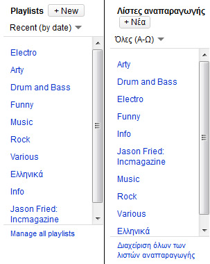
This is a screenshot from the playlist browser of YouTube in the “MyVideos” section of my account. On the left is the Firefox version and on the right it’s the Google Chrome version. The first annoyance is the scroll-bar. Why does this box have to be of a fixed size? Wouldn’t it be easier if I could just see all my playlists right away?

The second annoyance is that for some reason on Firefox YouTube is in English while in Google Chrome it’s in Greek. I happen to be a Greek guy living in Greece, so I guess it’s not that much of a trouble but I assume that YouTube will be in German if I visit Austria sometime in the future. This will be harder to deal with. Finally I can’t understand why in the English version I see my playlists sorted by date while in the Greek version they are sorted alphabetically.

Another example of a detail in the web is what I’ve done with Deskhot‘s login form. While initially it’s hidden so that new users can focus on the sign-up form right away, it’s not an annoyance for regular users. Normally your username and password are saved in the browser, so all you have to do is click the login button in the login form. When a user clicks on the login link the login form comes down. The login button is then placed in the same place where the login link was. So all you have to do is just click twice without moving your mouse.

login button placement