A web design modeled after a literature magazine
Note: This is a post written on August 11, 2010 in my personal website, Bibakis.com.
It has moved here, mostly for archival.
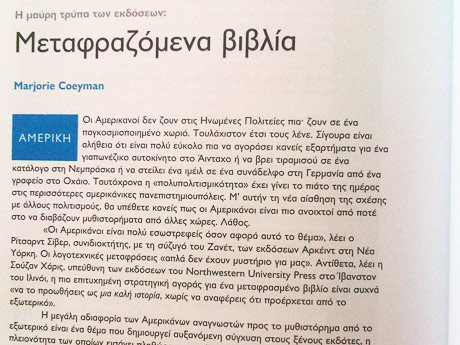
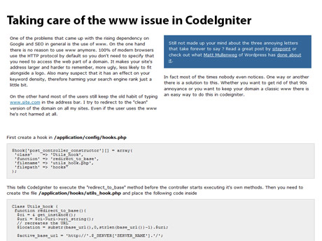
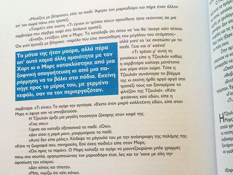
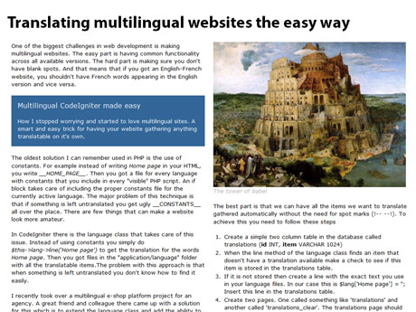
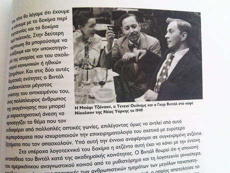
My latest experiment. A redesign of my website using a literature magazine as a source of inspiration. The idea came to me while I was reading this magazine in a local cafe.I thought that the newspaper and magazine industries have been existing for decades now. Thousands of talented people have evolved the science of text layout in printed media. The web is not very different from that. If you think about it, both the web and printed press give you a flat surface where text is displayed.
What I see all over the web is a lot of people trying to create a great layout for their website or blog. I don’t recall seeing anyone looking back in the past. This has been done over and over before. Why reinvent the wheel ?
I used a two column layout to achieve better readability. Mainframe CSS framework handled the layout through the 960 grid system. On the server side, I moved from Drupal to a custom made system based on CodeIgniter which will power all the websites I’ll build from now on.

