Why web designers should kill the hover right now and how to replace it
Note: This is a post written on August 29, 2010 in my personal website, Bibakis.com.
It has moved here, mostly for archival.
The hover effect or “mouse over” back in the early days is quite common in websites these days. Unfortunately it’s one of those bad habits that harm the user experience. I guess in a few years we’ll be laughing at hovers, like we now laugh at frames and tables.

Touch is here to stay
As we speak about 200,000 touch screen devices are purchased in the US alone every day. This includes Android smartphones, iPhone and the iPad. You can easily imagine that in a couple of years touch screens will be the norm and mouse based interfaces will be considered “business tools”. Instead of creating multiple versions of your web application why not consider getting rid of mouse-only features ?
Even if people continue to use computers at the same rate as they do today in the future, and even if you don’t plan to deploy your application on mobile devices you still need to forget about the hover. The average user will soon forget that you can expect something to come out if you place your cursor in a link. The reason is that users won’t be running into hovers on the majority of devices (and the most part of their browsing time).
Drop down menus
This is one of the major annoyances in the web for quite some years now. When evolutions in CSS popularized the use of drop down menus, a lot of designers tried to imitate the behavior of desktop applications. Unfortunately they forgot a very important aspect of desktop-like menus. Once you click, they stick! The sudden disappearance of sub-menus made surfing an adventure since users were expected to hunt menus around the page. Have a look at this great study on the topic: Users Decide First; Move Second
If it’s not visible it doesn’t exist
From time to time I’ve happen to surf Facebook with a friend or two. The majority of people I know are not aware of the additional options when hovering over some areas of the page. This is not a surprise as hover destroys the principle of what you see is what you get.
Can you imagine a car or a cd-player with hidden options ? I guess not. Then why should we design web interfaces that way ? Can we realistically expect people to scan the whole screen with the mouse, just in case the designer had the idea to hide some elements ? Most people have a quick look at the page and if something doesn’t appear there they just assume it doesn’t exist. Of course they are right to think so. Nothing else requires you to imagine where parts of it’s functionality are hidden but the web of today.
How can you replace mouse over
Organize information the smart way
The best way to de-clutter an interface and therefore avoid the need for hiding things, is to organize information in a human friendly manner. If you build your information structure in a simple and efficient way, everything can be “hidden” in the next page. The best example I can think off is the apple homepage.
Apple is a multinational company selling a huge variety of products and services, from smartphones and mp3 players to business server operating systems. Yet, in the main menu of apple.com website there are only seven options plus the link to the home page. Let’s take the “Mac” section for example. Instead of having a drop down menu with sub-options like MacBook, MacBook Air, iMac and so on, you are given these options only once you are taken to the “Mac” section. Each page has as few options as possible, yet you never feel that something is missing.

Apple.com’s main menu: Only seven options in a website with a vast amount of information
Use “click and drop” (pop-over)
This is a relatively new technique to the web. When you click on a button, you are presented with some options regarding your further actions. This is a great way to hide things like advanced search options. In the picture on the right you see an implementation in the main menu of startupdonut.co.uk.
In this case, a user with a touch screen device can navigate as good as the mouse users and all the extra options are well hidden until you click topics button. An excellent use of the “click and drop” technique is anywhere you need filtering. For example, search results, viewing a list of products or like in our example, viewing blog posts tags.
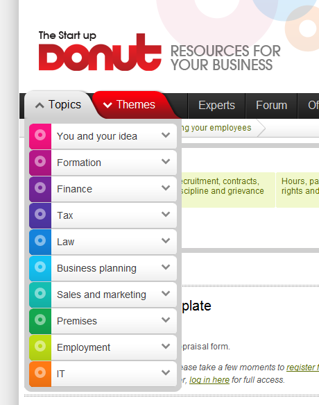
Clicking “topics” on the main menu of startupdonut.co.uk opens up the list of tags
Don’t forget lightbox
Lightbox is a nice solution when you want to give some information to the user quickly without sending him to another page. By clicking on a button you display a box on top of the page which can be an image, some HTML, or an iframe. You can use lightboxes for things like displaying notifications, showing the terms of use in a registration page, giving the user a quick preview of a shopping cart or for zooming images in a gallery. In the example on the right you can see the way facebook implemented it for sending a quick message.
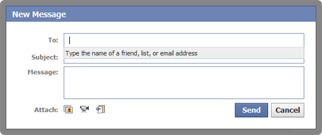
The most common implementation of lightbox: Sending a message on facebook