With the new MacBook Pro, for the first time, a high resolution retina display is used on a computer. A large number of questions are raised about what software and web developers must do, to ensure their software products conform with what seems to be, a new generation of computers. First of all…

Does the retina MacBook Pro signal a new generation of computers ?
Yes it does. As the smartphone market already proved, Apple never had any interest in turning the river back. The retina display is a huge advantage for Apple and it is certain, that in two years the most, the entire Apple line-up will feature the retina display. With other computer manufacturers (most notably Sony) already using high definition 1920×1080 monitors in a wide range of products, it will not be a surprise if we see the entire PC market going down the high resolution road pretty soon.
What exactly is the retina display ?
It is a display with double resolution than the classic displays, most of us use in our computers. For example the iPad 2 had a resolution of 1024×768, the iPad 3 which uses the retina display has a resolution of 2048×1536. Similarly the “simple” MacBook Pro has a resolution of 1440×900 while the new retina MacBook pro has a resolution of 2880×1800.
Does it mean that everything on the retina is smaller ?
No. Retina was created to increase the clarity and sharpness of displayed elements, not to fit more stuff onto the screen. Everything on the retina display takes up four times more pixels than a classic display since the retina display provides four times more pixels (two times more pixels times two dimensions = four times more pixels). However the end result to the user is that everything looks like still having the same size, but rendered using four times more pixels, therefore looking much better.
For example, a 960 pixel web layout will still occupy the same space on a retina display but will be rendered using four times more pixels. In other words the browser will automatically “convert” it to a 1920 pixel layout without any change required in the markup. Try to think the retina display as change in pixel density, not in pixel number.
OK, so what’s the catch ?
While text is rendered using the operating system’s fonts which are already designed to be rendered equally good at any size, the same is not true for images. When your computer renders a font, it just needs vector data from the font file and then the operating system takes care of the rest. However when you need to display an image in a space four times larger, you need to have the information about the pixels that will occupy the new space. It is like trying to display a 300×100 image in a 600×200 space using <img src=”something.jpg” width=”600″ height=”200″ />.
Showing an image in the retina is something similar . The browser will have to display an image in a space four times larger and inevitably will have to guess the new pixels in order to resize the image. Unfortunately it is impossible for any software to make a guess good enough to resemble what an image should really look like if it was four times larger.

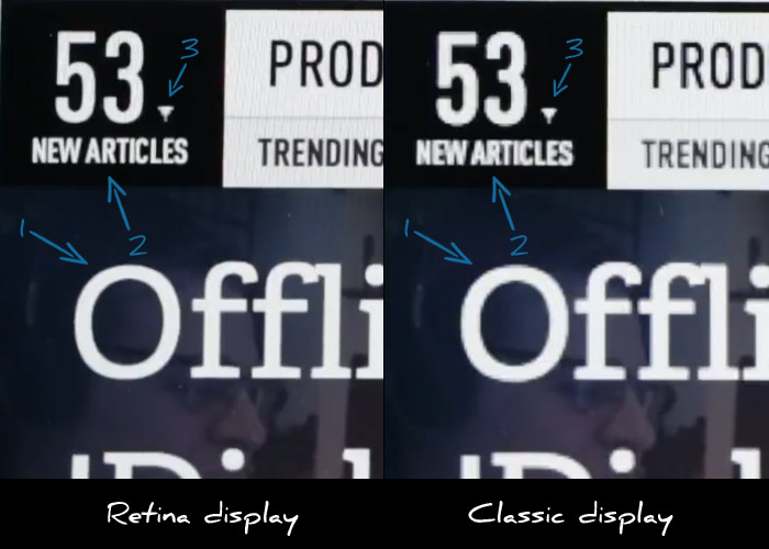
Let’s consider the above image which is a still from the Verge’s review on the retina MacBook pro.
I have highlighted the following three points of interest:
- MacBook pro on the left renders the letter O’s curves with much more detail making it much sharper.
- Small text looks much more readable on the retina display.
- The retina display fails to render the small triangle with more precision.
As you easily see, while text rendering is noticeably improved, images appear “pixelated” since they cannot provide any additional visual information. Websites that use images to display text elements with fancy fonts (for example in menus) will have their menus appear “pixelated” when compared to sites that use plain text. This means that this already bad practice is now even worse.
What about photos ?
As we’ve already discussed it’s up to the browser to resize the image. Does that make any actual difference to the user or do resized images look good enough ?
As it stands, browsers do a terrible job at resizing images. Resized images look blurry and pixelated. The best resizing software that I’m aware of is Adobe Photoshop. So let’s assume that browsers will not be late to implement an equal quality filter when resizing images. How will that make photos look on retina displays ?

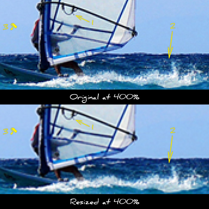
Let’s use this photo as an example. In the next two thumbs I cropped a small part of the image and zoomed in to 400%, so that all details are clearly visible. The first preview is a piece of the image with no resizing implemented. The second one is the same part, resized to twice it’s size and then downscaled back to the original size so we can compare the two.

Notice the following differences:
- The sail has lost some of it’s detail
- The waves look blurry and far less detailed
- The blue in the sky looks washed out
As you can see the reduction in image quality is quite noticeable. As a result there will be a noticeable advantage to websites that take care to provide higher resolution images.
How can I provide images for retina displays ?
The best way to avoid resizing is to provide images with double resolution even if you want to display them in in half their size. This is done by specifying a smaller size in the width and height attributes in the image tag.
For example let’s assume that you want to display a photo in a 300×300 pixel box. You should upload and use a 600×600 version of the photo and use the following markup: <img src=”example.jpg” width=”300″ height=”300″ />. This way your image will be shown in a 300×300 pixel box, but the browser will have enough visual information to show it correctly in higher resolution displays since you provided an image of double resolution.
Note that this technique requires that you do actually have higher resolution images. If you try to use this technique using low resolution images resized in software like Photoshop, you will only move the resizing procedure from the browser to your photo editor. This way you will still provide low quality images while wasting your time resizing and greatly increasing the image size. Which brings us to our next question…
What is the bandwidth cost ?
While providing higher resolution images is a great practice and greatly improves the user experience, one shall not forget the increased bandwidth required for downloading these images. Of course there is no general rule as to how much the size increase is, but depending on the image the increase in file size can be up to 4x.
Such a file size is forbidding for mobile users. Developers should resort to server side browser detection techniques to serve lower size images to mobile users. Even if you use responsive design techniques for your layout, you won’t be able to avoid the server side for the images part.
Conclusion
Higher resolution displays are here to stay. We should all make haste to implement new ways of providing high detail images to our web sites and applications. However one should carefully study all available options before choosing which way to go. Expect more on this as I will have my hands on a retina MacBook Pro in a couple of weeks.

