topic: Business | Thursday, April 28, 2011
A few weeks ago Google launched the +1 button. Just in case you are not aware of it yet, it’s a small button which allows you to recommend a search result to your friends. It made the headline in a huge number of blogs around the web as the answer to Facebook’s like button. Unfortunately it’s already on it’s way to abandonment like buzz and Google wave.

Like most of the people I type a query, then the results show up, then I scan the results for a while and click on one of them. The surfing goes on and on until I need to perform another search. I don’t click the browser’s back button to return back to Google because I want to keep the page I’m currently viewing. Instead I perform the new search in a new tab.
Facebook’s like button is embedded in most websites and doesn’t interrupt my surfing. But in order to recommend a page with Google’s +1 I have to stop whatever I’m doing on the web and navigate a few pages back to the original search results page and then find the exact result I’ve clicked the first time. It’s a no-brainer that nobody wishes to interrupt his workflow to click a recommendation button.
It’s quite obvious to me that this is a pointless feature (at least in the way it’s implemented right now). There is no point for Google to have a recommendation button because people can’t recommend a webpage they haven’t visited yet. It’s a clear case of a company trying to imitate a successful feature from a competitor instead of really improving it’s own product. And the best way to know what your product is missing is to use it. Ever worse Google is trying to copy features from a social network to a search engine.
So if you are creating a product, just use it. Forget what the competition does and just add value. Not only there is no point in re-creating something that is already out there in the market but chances are that you are trying to fit yourself in someone else’s clothes.
topic: Academy | Wednesday, April 20, 2011
Sometimes it’s the little details in life that make your day. The same goes for the web. Unfortunately the attention to detail vanishes sometimes in most big websites.

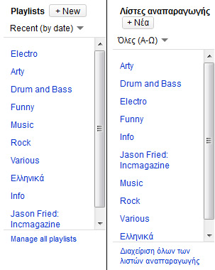
This is a screenshot from the playlist browser of YouTube in the “MyVideos” section of my account. On the left is the Firefox version and on the right it’s the Google Chrome version. The first annoyance is the scroll-bar. Why does this box have to be of a fixed size? Wouldn’t it be easier if I could just see all my playlists right away?
The second annoyance is that for some reason on Firefox YouTube is in English while in Google Chrome it’s in Greek. I happen to be a Greek guy living in Greece, so I guess it’s not that much of a trouble but I assume that YouTube will be in German if I visit Austria sometime in the future. This will be harder to deal with. Finally I can’t understand why in the English version I see my playlists sorted by date while in the Greek version they are sorted alphabetically.
Another example of a detail in the web is what I’ve done with Deskhot‘s login form. While initially it’s hidden so that new users can focus on the sign-up form right away, it’s not an annoyance for regular users. Normally your username and password are saved in the browser, so all you have to do is click the login button in the login form. When a user clicks on the login link the login form comes down. The login button is then placed in the same place where the login link was. So all you have to do is just click twice without moving your mouse.

topic: Business | Sunday, April 10, 2011
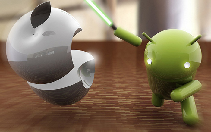
There’s a lot of talk over the past year on the ongoing battle between iOS vs Android or Apple vs the world. Everyone has arguments for and against both sides and you’ll find it very easy to find a vast amount of blog posts on the issue. Apple’s consistent experience versus the freedom of open source. The Windows vs OSx debate reborn. I won’t try to persuade you to take one side or the other. I only want to take you back in time 16 years ago and remind you of a few things that a lot of us seem to forget these days.

Back in August of 1995 Microsoft was releasing Windows 95 and everyone was going crazy. It may sound funny right now but back then Windows 95 was the most successful operating system ever produced. Of course the Mac guys had their arguments as well and everyone was picking sides, much like now.
A few years later the Internet started to take off and other major players came up in the tech scene such as Yahoo and Google. Despite being a hostile and adventurous place at the time it kept growing and growing until our days, where everyone considers connectivity to the cyberspace a necessity. Most desktop software producers have gone out of business and only a few key players still remain. Even traditional desktop strongholds like gaming have been outgrown by web based companies such as Zynga.
Web based software had some huge advantages over native desktop solutions all the time. You don’t have to develop a separate version for each operating system, web software is cross-platform by default. You don’t have to care for the user’s hardware, the browser handles it. You don’t have to care about piracy, web software is never given to the user. Your users don’t have to be techies to use your software, it’s already installed on your server.
16 years later does it matter if Microsoft delivers a better operating system than Apple ? Who in his right mind would dare start a desktop software company today ? So real the question is: Why pick sides once more, why take place in the same pointless debate of one platform over the other ?
Of course you can be “cutting edge” and start developing for iOS or Android and make good money for a few years. Yet you must not forget then once the fad is over, the economics of scale that the web provides will prevail once more and native mobile applications will become a thing of the past just like desktop software did.
topic: Demian Labs | Monday, April 4, 2011
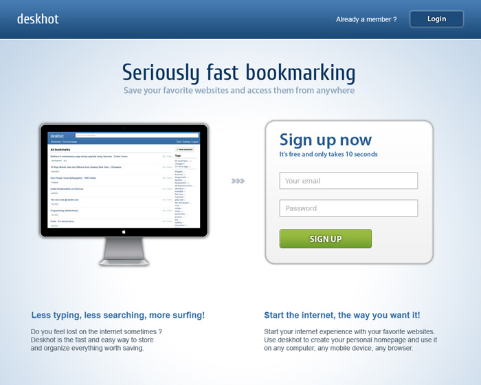
With it’s first public release scheduled for April 11 it’s time to show you what’s coming. Since Deskhot is the no-nonsense approach to web bookmarking, it’s introduction screen follows the same principle. And since we’ve taken anything unnecessary out of the equation it’s “Seriously fast”!
