Thursday, February 16, 2012 , topic: Academy
We all know about Google’s plus one button. What most of us don’t know is whether it is something more than a way for people to like our website our product. Since it’s made by Google, a lot of SEO specialists have suspected that Google may improve the search engine rankings of websites using the button, with the obvious end goal of making the button popular.
As with all things SEO, there’s no scientifically proven answer to this question. Even if Google does modify it’s search engine rankings in order to promote it’s own product (button) it will never admit it in public. All we can do is observe and assume.

A couple of years ago I built a small util that generates random text. It helps designers by providing random text that looks real in their demos. You may have guessed by now that it’s called random text generator. It’s just a language selector and a form essentially so I’ve had just a couple of ads on top and on the side of the form just for the sake of it. The ads are bringing some change every month but nothing serious. The traffic is a few thousand page views a month.
When the plus one button came out, I though I’d give it a try on this tool and see how it goes. About four months ago I removed the top advertising banner and installed the button next to the logo as you can see in the image above. To my surprise the advertising revenue did not change at all, despite the fact that I’ve removed half the advertising space. I guess this is yet another reminder that advertising, when done on a small scale and without serious targeting is practically worthless.
However traffic from Google started rising almost immediately on a rate of 10% to 15% per month. The cumulative traffic growth over the last four months is around 50%. The best part is that in contrast to retweets and facebook likes the google plus button clicks stay. Any people with google+ friends who clicked the button will see it as a recommendation in their search results now and in the future. Of course facebook and twitter buttons have other uses and benefits and I’m not suggesting not to use them.
However the moral of the story here is that the Google plus one button seems to work very well and is definitely worth a top spot in any webmaster’s toolkit. Also since I’m promoting other products of mine on this website from time to time, it is a nice outcome to increase traffic and reduce advertising space. Of course none of the above is official and it’s just my personal observations, but I hope you get the point!
Update:
It seems others have also noticed SEO benefits from the +1 button.
The latest that caught my eye is a post from INC magazine.
Saturday, October 29, 2011 , topic: Academy
Responsive web design is the latest buzzword in the web world. Everyone is making haste to learn about conditioning through media queries, flexible grids and so on and so on. However responsive design as it’s used at the moment is a negative trait and should be avoided at all costs. The reason is, that it’s a negative term by definition.

You are confused a bit, right ? How can it be negative when you’ve seen all those great examples of websites that scale according to your device’s resolution. It seems to work in real life. Well I doubt that. And to throw our beloved responsive design showcases away, and get along with our post, just remember that all those great examples are simple content sites. And to make a long story short, simple content websites don’t justify the time needed to produce a great responsive design. Most of the times a wordpress with a mobile device detection plugin and a great mobile theme does the trick far easier.
For all other cases where you have a more complex website or a web application, where extra time and research is justified, responsive design still won’t do. And this because responsive design destroys the “device scemantics” (I just made up the term). This means that we use devices for a reason. Each device has a purpose and meaning, a reason why we bough it and why we use it.
For example, say I just landed from a plane and want to find quickly the phone number of Hotel X. I got my luggage in one hand, my coat on the other and can’t hold my phone near my face. If you show me a responsive design of the hotel’s website with lots of pictures and small text you’ve just made me angry. I already had trouble typing your website’s URL in the browser and just need a huge link labeled “Contact details” so I can call you and make sure my reservation is ok.
Of course the same is true not just for content but for apps as well. A form might be reasonably large when viewed from a desktop computer but way too big for a tablet or phone. I will want to store a PDF with an printable application form on my computer but will prefer the HTML version in my iPad.
Each device has it’s own natural time and space in our lives, we can’t just serve the same content and functionality everywhere just because we find it easier to have only one version of our website. Each device type has it’s own context and purpose and it’s our duty as web professionals to serve that purpose. Just because your layout doesn’t break on a smaller resolution, does not mean that you provided the functionality your visitor expected.
The way I see it, responsive design is an ugly workflow hack. And as such, it will not improve your long term strategy, whatever device type you consider your priority. Mobile web and tablets are way too important to be left in a hands of a few divs that collapse below each other when the resolution changes. Oh! and three wireframes simply will not do.
Responsive web design techniques should be used as an assistant to overcome different device specifications of the same type. Use these techniques to make sure that your website displays correct across all mobile phones but don’t take the same website to another type of device. If you plan to deploy on mobile and tablets, do yourself a favor and do it properly, with the right amount of planning and research.
Saturday, October 29, 2011 , topic: Demian Labs
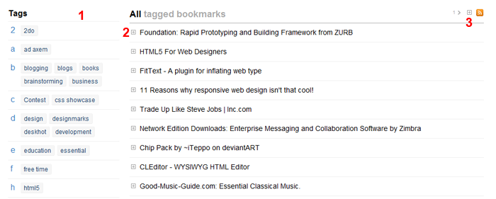
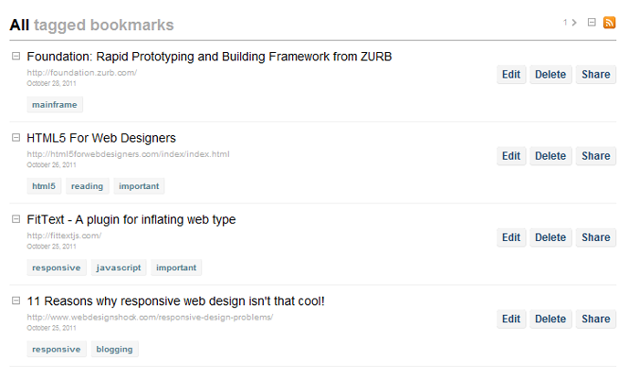
I’ve uploaded a few changes in Deskhot which make the interface simpler and easier to use. Now your bookmarks in Deskhot look like the picture below:

The new interface
1) The new tags index now groups tags by letter and shows group letter in the left side. This allows you to scan the index very fast when looking for a particular tag.
2) All extra options of a bookmark (edit/delete/share) and extra information like tags and date, are now hidden and you can show them by clicking the small expand button next to a bookmark. This way you can now focus on your bookmarks and find very easy the one you are looking for instead of being distracted by the many buttons of the previous interface.
3) Just in case you prefer the old way of having tags and buttons shown for all bookmarks, you can click the expand all button. Deskhot will remember your preference and keep it that way if you want all your bookmarks expanded.
3b) You may noticed a number with a small arrow next to it. This is the next page button. So now you don’t have to go to the bottom of the page to find the next page link. This is very useful when you remember that a bookmark is on page 3 for example. You can find it with just two clicks.

Expanded bookmarks
The new changes make Deskhot an even better tool for your bookmarking/archiving/organizing needs. I believe now it’s one step closer to the original vision of a central place to store all your information. The new notes feature which I’m already preparing will bring it even closer to that goal.
Monday, October 17, 2011 , topic: Academy
Yesterday I was traveling from Athens back to my hometown. I woke up in the middle of the night cause of the endless snorring of one of the guys that shared the cabin with me. As I walked dizzy in the hallway trying to get a grip as to where I am, (and most of all, which floor) I reached the stairs and saw two large numbers right between the two floors. I immediately realized that I was in deck 8 and headed down to grab a coffee. It’s was really great to notice that instead of the millionth boring advertisement, someone thought that huge deck indicators were the way to go.

In the end of the day great user experience is quite simple. All it takes is walking in your user’s shoes. The rest comes quite naturally.
Wednesday, October 5, 2011 , topic: Demian Labs
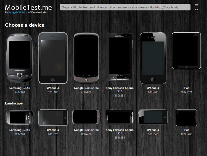
MobileTest.me is a tool that allows you to see how your web site or app looks across different mobile devices and resolutions. You select a device, type the URL you want to test and it will show you the selected device displaying your website in the device’s original resolution. As you can see in the picture below all types of devices are covered, from the relatively small Samsung S3650 to the iPad.

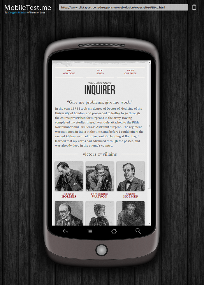
Everytime you test a different website, the URL changes dynamicaly. This allows you to send the exact same test to someone just by sharing the URL. For example this link is a classic responsive design example by a list apart as seen on the Google Nexus one in landscape mode. Real life scenarios include showing completed work to clients or pointing out bugs and errors to collueagues.
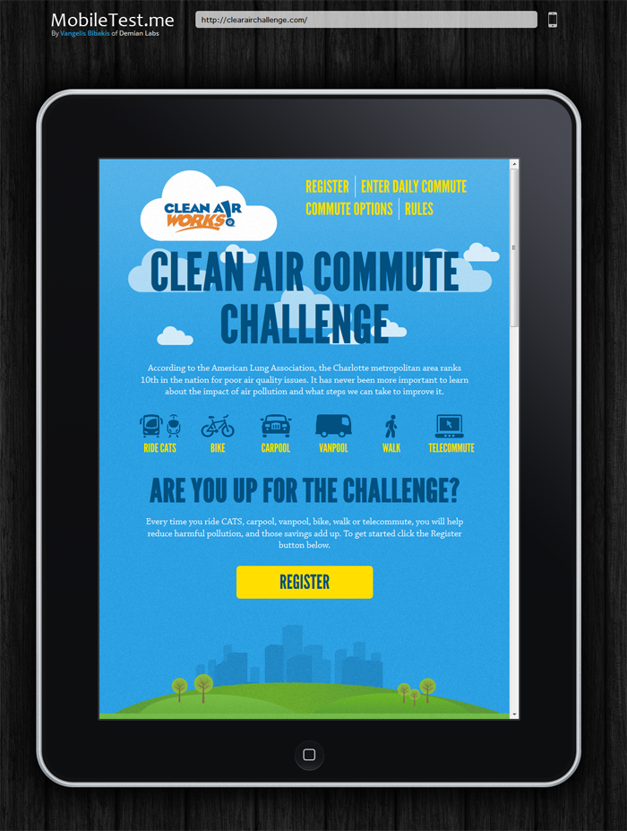
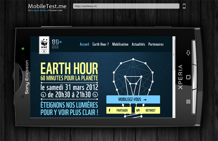
Click on any of the images bellow to see the corresponding test.
