Taking care of the www issue in CodeIgniter


Note: This is a post written on July 24, 2009 in my personal website, Bibakis.com.
It has moved here, mostly for archival.

One of the problems that came up with the rising dependency on Google and SEO in general is the use of www. On the one hand there is no reason to use www anymore. 100% of modern browsers use the HTTP protocol by default so you don’t need to specify that you need to access the web part of a domain. It makes your site’s address larger and harder to remember, more ugly, less likely to fit alongside a logo. Also many suspect that it has an effect on your keyword density, therefore harming your search engine rank just a little bit.

On the other hand most of the users still keep the old habit of typing www.site.com in the address bar. I try to redirect to the “clean” version of the domain on all my sites. Even if the user uses the www he’s not harmed at all.

In fact most of the times nobody even notices. One way or another there is a solution to this. Whether you want to get rid of that 90s annoyance or you want to keep your domain a classic www there is an easy way to do this in codeigniter.

First create a hook in /application/config/hooks.php

$hook['post_controller_constructor'][] = array(
 'class'    => 'Utils_hook',
 'function' => 'redirect_to_base',
 'filename' => 'utils_hook.php',
 'filepath' => 'hooks'
);

This tells CodeIgniter to execute the “redirect_to_base” method before the controller starts executing it’s own methods. Then you need to create the file /application/hooks/utils_hook.php and place the following code inside

Class Utils_hook {
 function redirect_to_base(){
  $ci = & get_instance();
  $uri = $ci->uri->uri_string();
  // recreates the URL
  $location = substr(base_url(),0,strlen(base_url())-1).$uri;

  $active_base_url = 'http://'.$_SERVER['SERVER_NAME'].'/';

  if (($active_base_url != base_url()) && ($_SERVER['SERVER_ADDR'] != '127.0.0.1')){
   Header( "HTTP/1.1 301 Moved Permanently" );
   Header( "Location: $location" );
  }
 }
}

This way the visitor is always redirected to the URL version you want even if he entered through an old bookmark such as http://www.sitename.com/action/example/

Top or bottom of the page ? Where should you load your JavaScript ?


The JavaScript placement debate

A few years ago, Yahoo released a free benchmarking tool for web pages. Aka Yslow. This tool is measuring what and when loads, during a pageview. It then gives a report about what is slowing down your page and then makes some recommendations on how you can improve the performance of your site.


snail

One of these recommendations is that you should load your JavaScript in the bottom of the page, right before the closing </body> tag. The Yahoo people even went so far as to call this a “best practice”. Ever since, there is an ongoing debate among developers about the right place to load JavaScript files. Most people are indeed consider placing JavaScript in the bottom of the page a best practice. Is it so ?

When you put your JavaScript at the top of the page, the browser will start loading your JS files before the markup, images and text. And since browsers load JavaScript synchronously, nothing else will load while the JavaScript is loading. So there will be a timeframe of a few seconds where the user will see a blank page, while the JavaScript is loading.

On the other hand, if you place your JavaScript at the bottom of the page, the user will see the page loading first, and after that the JavaScript will load in the background. So if for example your CSS & HTML takes 5 seconds to load, and your JavaScript takes another 5 seconds, putting our JavaScript on the top of the page will give the user a “perceived” loading time of 10 seconds, and putting it on the bottom will give a “perceived” loading time of 5 seconds.

I’m using the word perceived, because in both cases the page will be completely loaded in the same amount of time. In whatever order you place your assets, they still take the same time to load. All we can achieve by placing JavaScript at the bottom is how fast the user thinks the page has loaded. But still it sounds amazing, right ? By putting JavaScript at the bottom of the page, our pages will appear to be loading twice as fast.

The perception of “the web”

Well this used to be the big picture in the past. Back then, when the web was something very different from what it is today. Overgeneralizing, for the sake of simplicity, this is how the web was perceived by almost everyone (including web professionals) until recently.
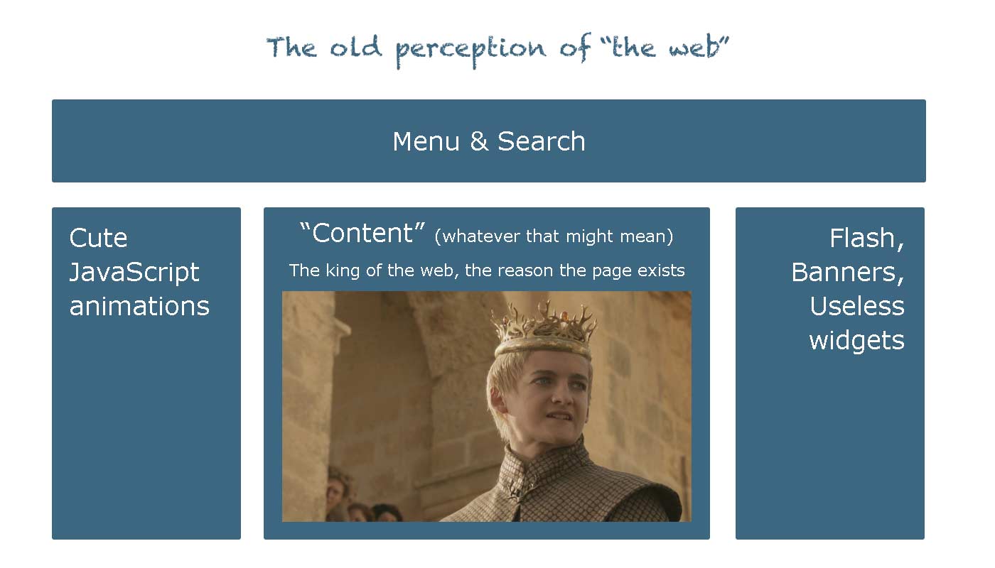
the old perception

Since then much have changed. First and most important, we don’t talk about “web pages” these days. We now talk about “web apps”, “software in the cloud” and “software as a service”. The web used to be more like digital paper. A way to let people know about your company, a platform for your blogging, at best a place to read your email remotely. But now in 2013 the web is quickly replacing the remnants of desktop software and is battling toe to toe with Java and Objective-C, for domination on mobile devices.

All these concepts were a utopia, no more than five years ago. But today the content is no longer the king. The web is now a democracy. People don’t come to us for content anymore, they create it themselves. Our role as web developers is to empower them, by giving them the tools and functionality to create and interact with their content.

Forget about supporting IE6 and browsers without JavaScript. This is just a 5% of people who fear change, like some people never bothered to buy a computer at all. In a world where we are competing with native mobile developers over performance and features, we can’t afford to think of the web as anything other than pure software. In a way, functionality is the new content and JavaScript is the new king.

JavaScript placement in web applications

Back to our topic. Let’s get back to our example, where we load our JavaScript at the bottom of the page. The user is left for a few seconds with a perfectly looking HTML template where nothing is functional. If the users tries to perform an action and finds out that it’s not working, he will perceive our application as “broken”. What’s even worse, is that we have no way of letting the user know when the app will be fully functional.

On the contrary if we place our JavaScript on top, the user will get a blank page for a few seconds, but once the markup is loaded, everything will be fully functional from the first second. Therefore by purposefully giving the user a blank page, we are giving him information that the app is still loading. The user knows that the app will be functional when he sees boxes and buttons.

The user may think that our app is slow, or that his connection is having hick-ups or even that his device is slow. Not only we don’t take the full blame for the slow loading of our app, but we eliminate the possibility of the user interacting with a broken version of our application.

A few seconds to load the app is one of the most common things in digital devices in general. People wait for computers to boot up, for youtube videos to load, for Microsoft Word to open, for almost everything. Nobody will go crazy for a couple more seconds of waiting. But there is nothing worse than a user tapping a button which does not work. This is a breach of trust from the user end. If the app didn’t function correctly now, will it lose my data tomorrow ? Should I pick another app instead ?

Even the slow loading experience can be eased, using a simple loader like Gmail did.

gmail loading

Summarising, it really depends on what you’re making. If you’re still stuck in the “content” world then it’s maybe best to place your JavaScript at the bottom of the page. But if you are making web software you’re much better, placing JavaScript at the top, because functionality is the new king.

Our presentations to Joomla Day Greece 2013


Vangelis Bibakis recently gave two presentations to Joomla Day Greece.

In the first presentation he talks about MainframePHP, the framework we use to create web applications. The first parts of the presentation are a basic introduction with case studies and performance data. He goes into detail on how Mainframe compares to external libraries which provide similar functionality. This is also a great intro to people who are getting started with Mainframe and want to see how it implements concepts like theming and modularity.

Mainframe, the fast PHP framework from bibakis

In the How to get the tech job of your dreams presentation he explains why you should not have a CV and how to write a great cover letter.

How to get the tech job of your dreams from bibakis

The secret to pricing your SaaS product right


It’s far more simple than you may have thought. Also it’s more common sense than secret. Anyway it goes like this.

The million euros question

You (obviously) know your product, and you know the competition.

So since the main competitor in your field prices their equivalent product at $X/m, how much would you pay for your product. Oh, you have 5 seconds to answer…

If you can’t answer this question in 5 seconds, this means one or more of the following:

  • You don’t have a clear idea of what your product really is.
    You’ve built some features together, but you have no sense of the end result.
  • You have not studied the competition enough.
    You may have a good product, but you don’t know if it’s good enough.
  • You can’t put your self in the customer’s shoes.
    This is by far the worse case scenario. If you don’t know how people perceive and evaluate similar products, it’s very hard to know what features to build, how to advertise your product right and obviously how to price it.

Dollars stack

The tablet example

First of all let’s define tablets.

Tablets are the device that people use to get away from all the things that suck about computers. These include, Adobe flash, keyboards, cables, Microsoft office, loosing your work because of a virus, running out of battery after an hour, troubleshooting driver problems and many many others.

People use tablets to easily watch videos, surf the web, enjoy music, and talk with friends. They like them because they are simple, light and the battery lasts for long.

Microsoft released Surface tablet for $500, the same price as iPad. Surface had most of the problems in group A, where iPad had all of the qualities in group B. Surface’s only competitive advantage was running Microsoft Office natively. As we all know, MS Office is a boring piece of software most of us already use all day at our computers at work. Mostly because we have to.

So if the top competitor in the market prices it’s product at $500, and your product is heavy and boring, with a worse screen and poor battery life how much would you pay for it? I’d say $200 would be a fair price, although I’d still go for the iPad.

Microsoft failed to answer all of the above questions and ended up dropping the price by $150 a couple of weeks ago.

Who got the price right ?

Google was more respectful of the competition and priced Nexus 7 at an introductory price of $200. At the time android was not as polished as iOS, it didn’t have an equally large app selection, it was heavier and with a bit worse battery life. Still at $200 it was a very honest and competitive offer compared to iPad mini being 65% more expensive at $330.

The pricing path

Every day during the development of your product, it’s important to be respectful of the efforts of other talented people. The market is full of well established products that you simply cannot compete with without either an amazing product or a very competitive price.

The more you evaluate your competition the harder it looks. This not defeatism. This is realism. There is a good reason 80% of new companies fail during the first five years. This thought path will eventually lead you to the conclusion that in most markets it’s impossible to compete. For example I can’t imagine any startup competing with Gmail.

That’s perfectly fine, you don’t have to compete with giants. Through constant and honest re-evaluation of your pricing strategy you will understand in which market segment you can achieve a competitive pricing for your product.

The rule of thumb is that if you end up pricing your product very low, your are trying at a very saturated market. If you end up pricing your product very high, you are trying at a market where there is not sufficient demand. The pricing path leads to the ideal positioning of your product in the market, in a segment where you can realistically have a good chance of competing.

Irony is a loser’s trait


It’s fun to see Siri making fun of Android and Samsung at WWDC 2012.

It’s also fun to see Microsoft making fun of Siri in it’s latest commercial.

But it’s infinitely more fun reading IDC’s report on mobile OS market share for the first quarter of 2013.

Android: 75 %
iOS: 17,3 %
Windows Phone: 3,2 %

Losers always try to find cheap ways to degrade other’s work.
Winners are busy developing their next version.