A new deskhot homepage is coming
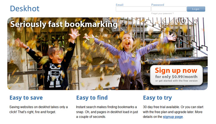
A new, simpler, cleaner homepage is about to go online for deskhot. This is how it looks.

The aim of the new design is to give out “the message” quicker. Taking out the gradients allows the eye to focus more on the text. On top of that the picture with the kids is great. It gives a warm welcome to new visitors.
