New in Deskhot: interface changes
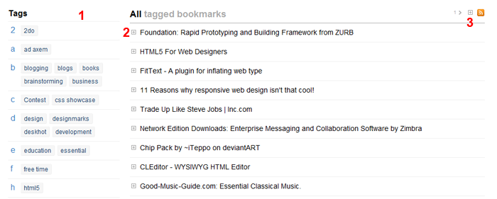
I’ve uploaded a few changes in Deskhot which make the interface simpler and easier to use. Now your bookmarks in Deskhot look like the picture below:

The new interface
1) The new tags index now groups tags by letter and shows group letter in the left side. This allows you to scan the index very fast when looking for a particular tag.
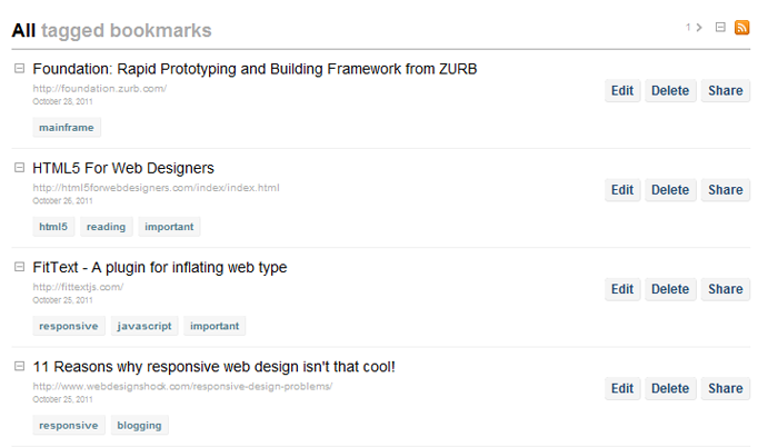
2) All extra options of a bookmark (edit/delete/share) and extra information like tags and date, are now hidden and you can show them by clicking the small expand button next to a bookmark. This way you can now focus on your bookmarks and find very easy the one you are looking for instead of being distracted by the many buttons of the previous interface.
3) Just in case you prefer the old way of having tags and buttons shown for all bookmarks, you can click the expand all button. Deskhot will remember your preference and keep it that way if you want all your bookmarks expanded.
3b) You may noticed a number with a small arrow next to it. This is the next page button. So now you don’t have to go to the bottom of the page to find the next page link. This is very useful when you remember that a bookmark is on page 3 for example. You can find it with just two clicks.

Expanded bookmarks
The new changes make Deskhot an even better tool for your bookmarking/archiving/organizing needs. I believe now it’s one step closer to the original vision of a central place to store all your information. The new notes feature which I’m already preparing will bring it even closer to that goal.
